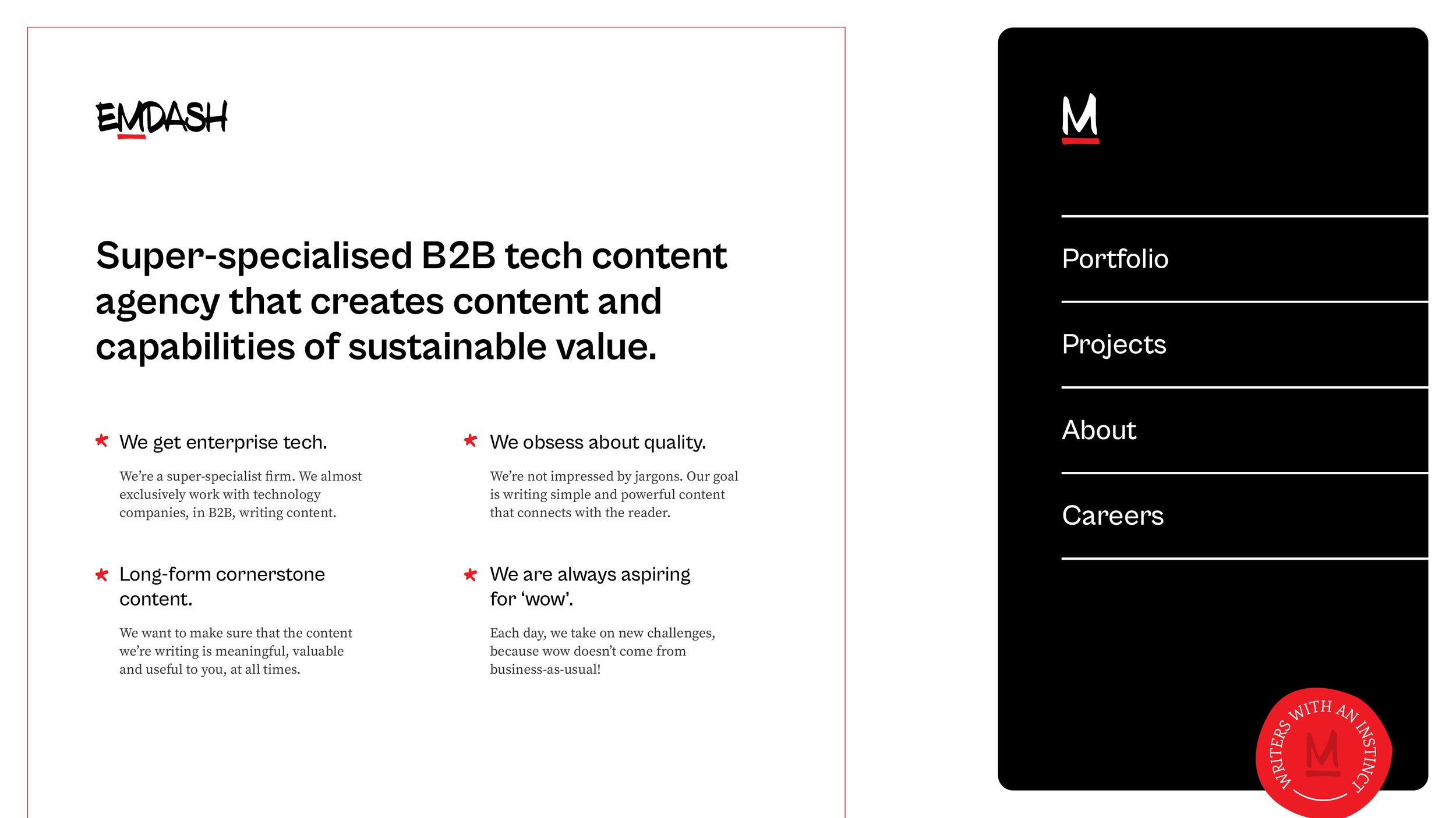
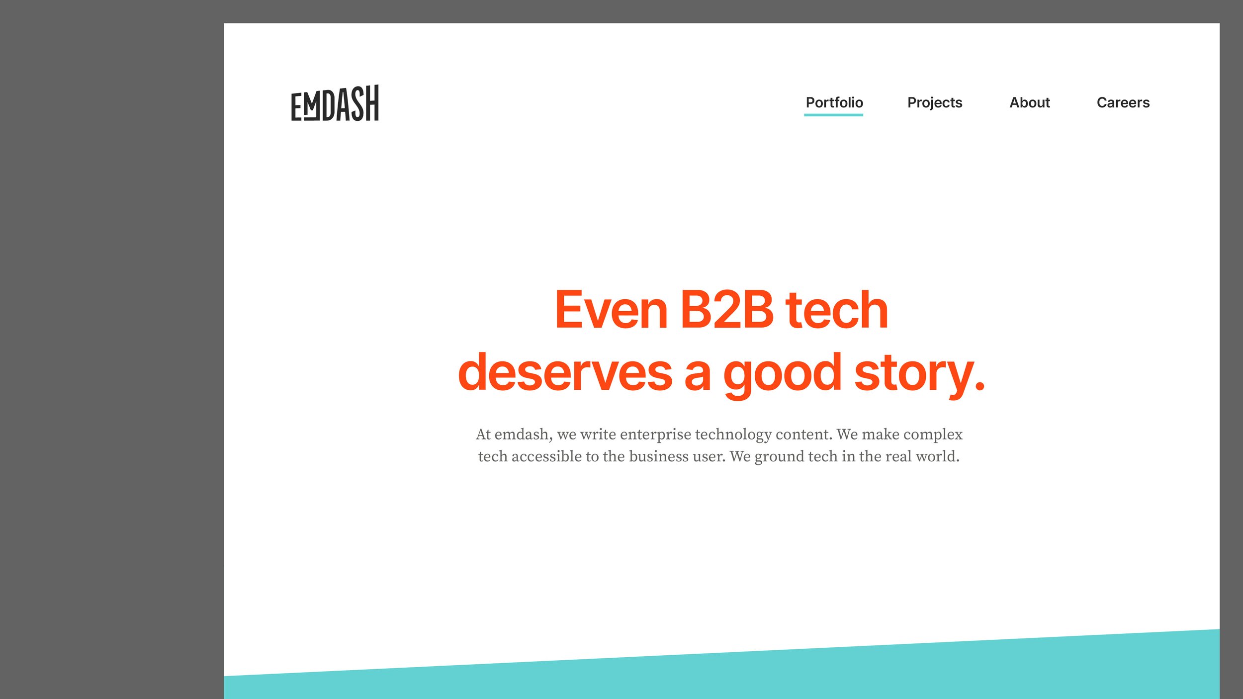
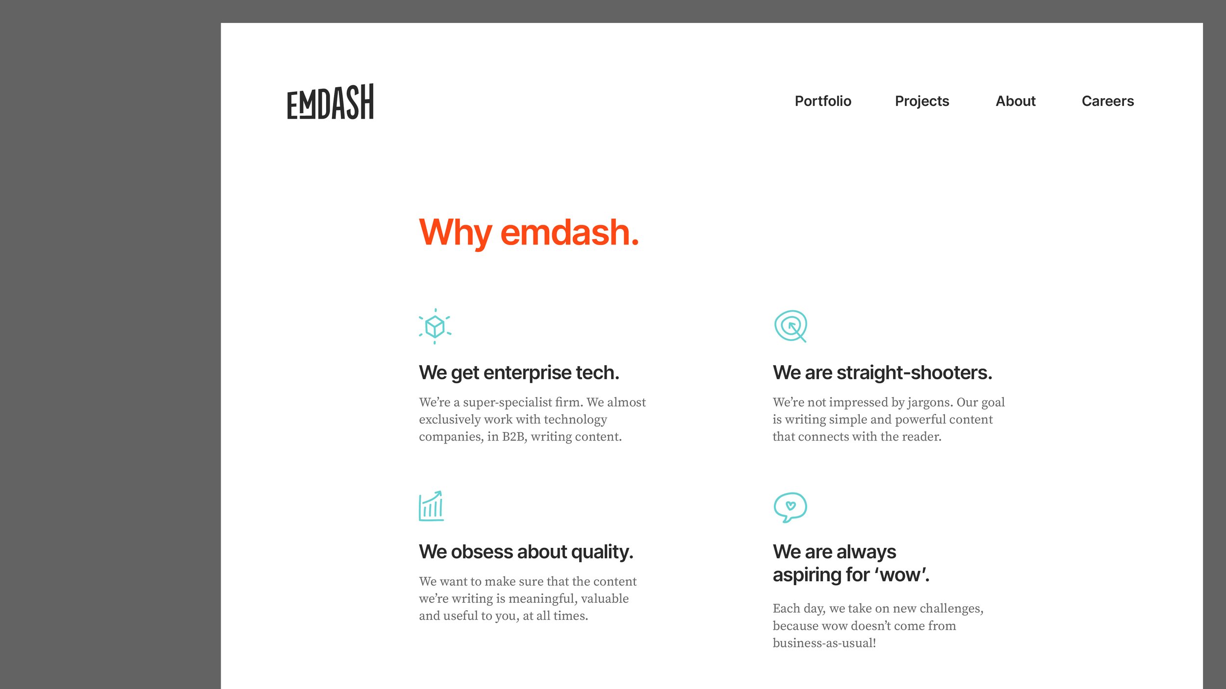
Emdash
Rebranding for boldness and ambition
Client:
Ranjani K / Emdash
Year:
2022
Services:
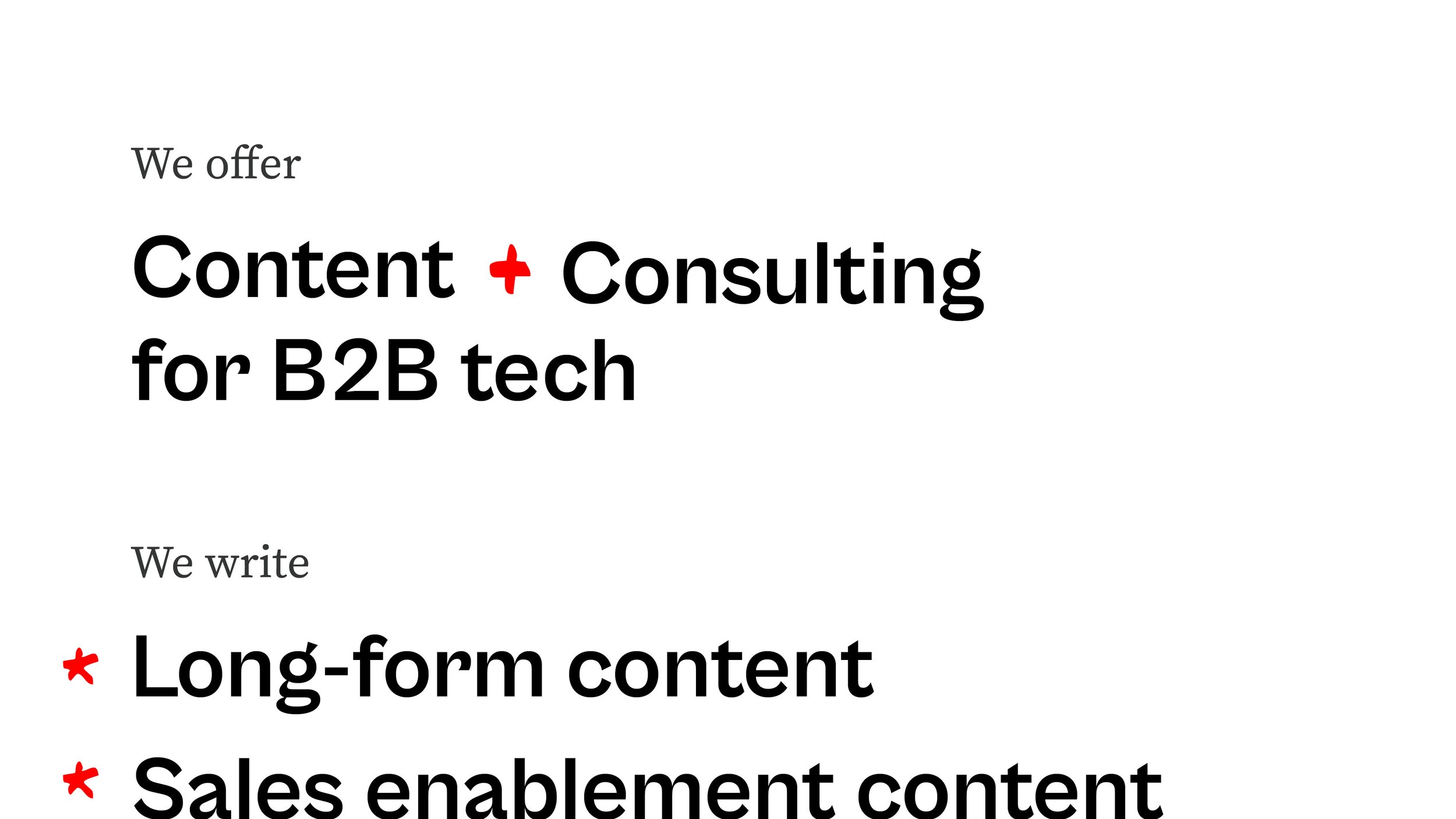
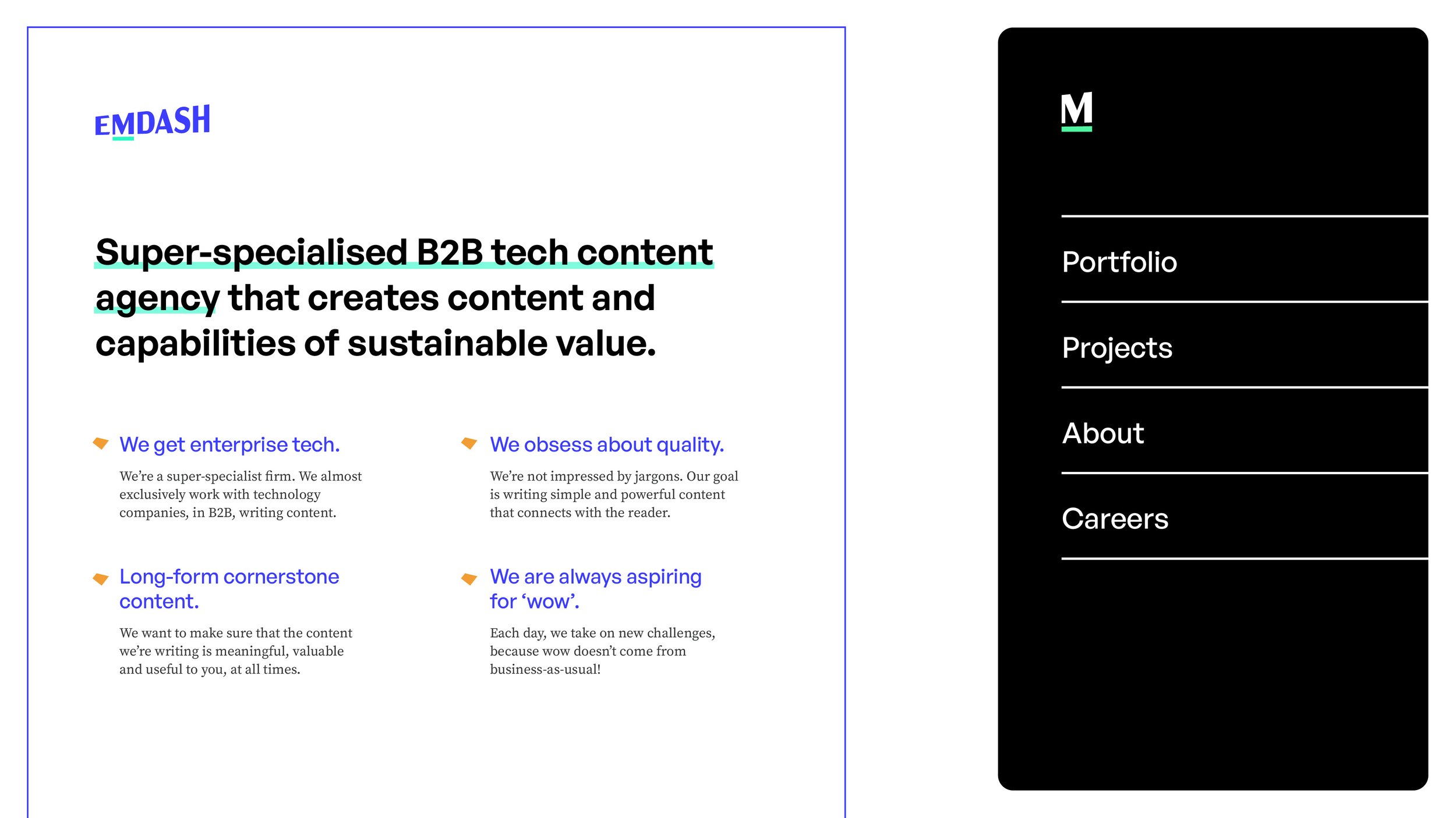
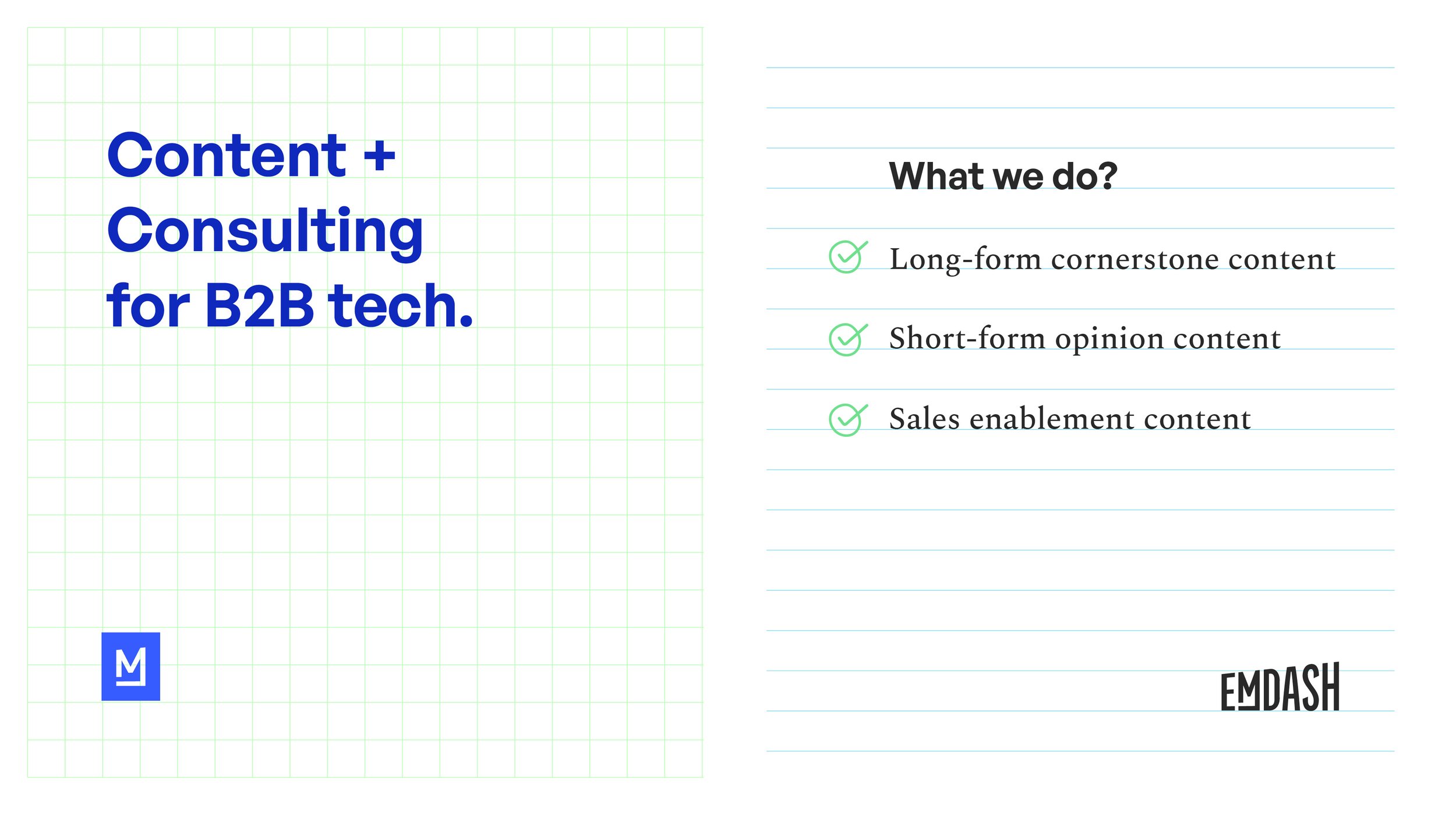
Logo & Identity
Branding
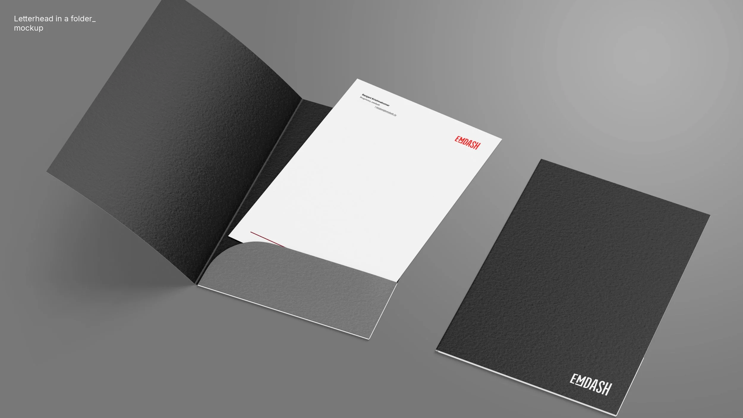
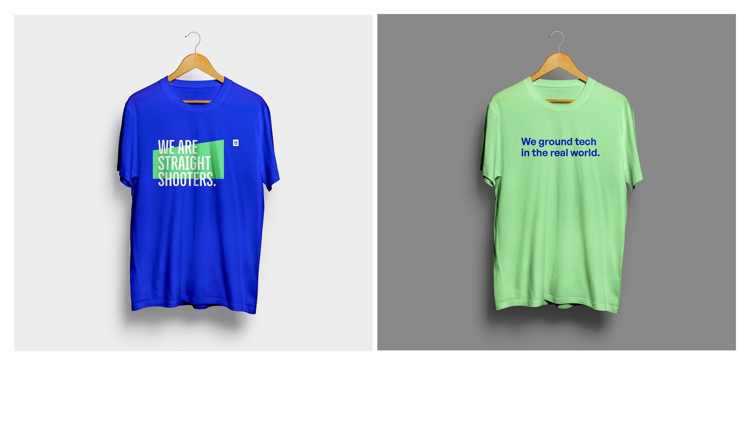
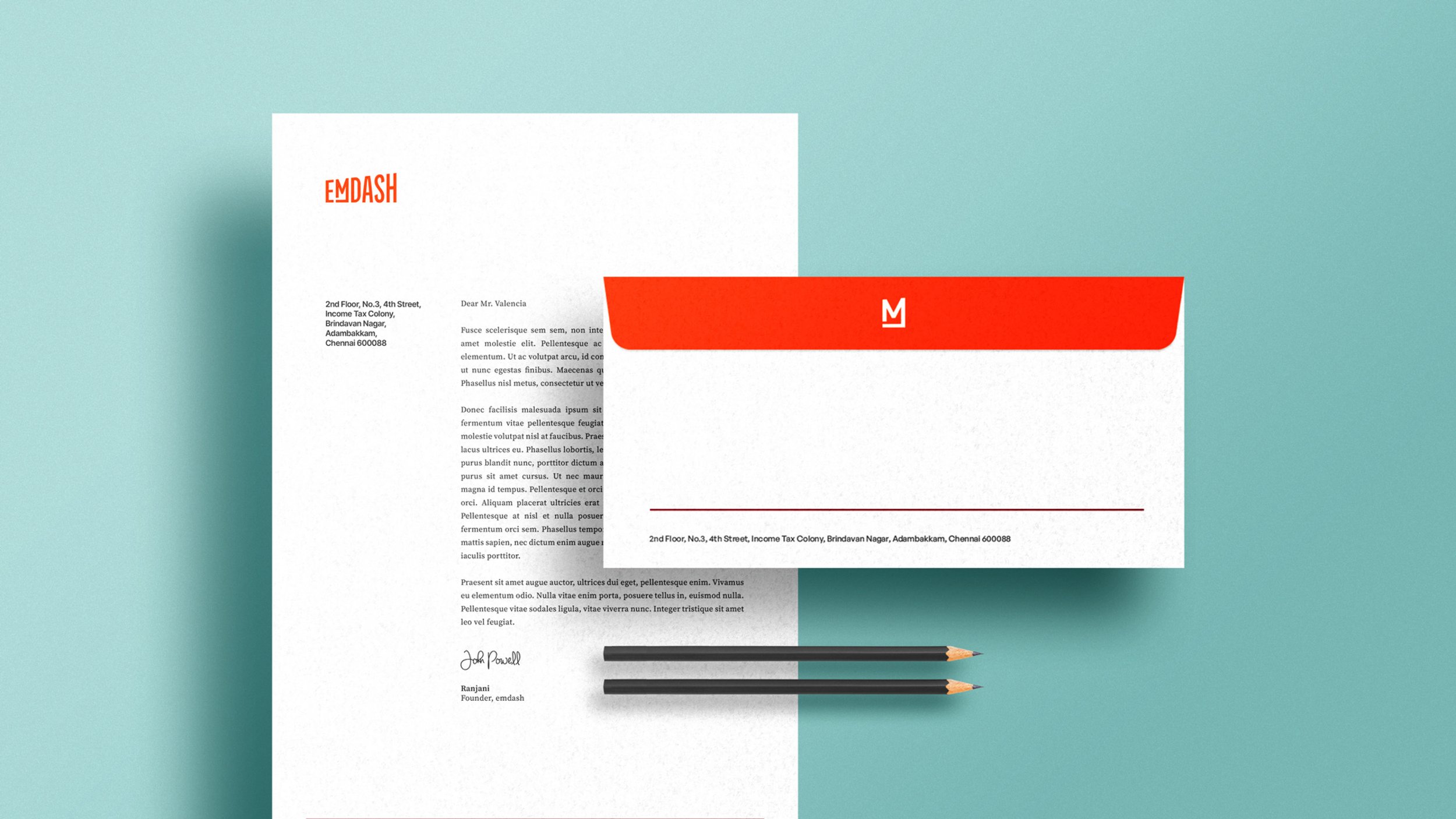
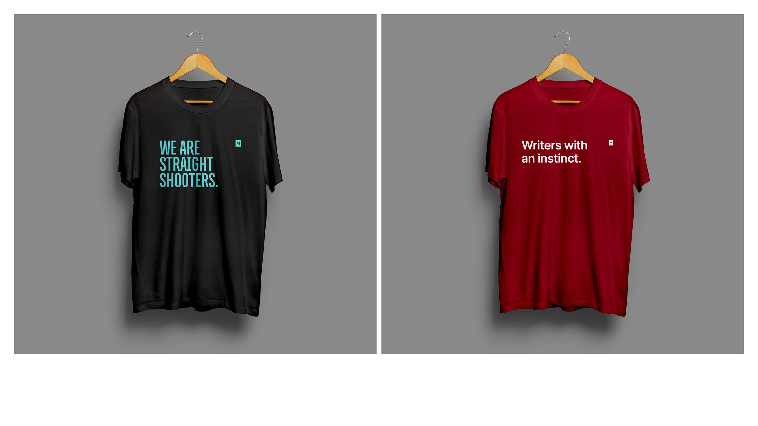
Merch + Stationery
Ideation & logo development


Initial iterations

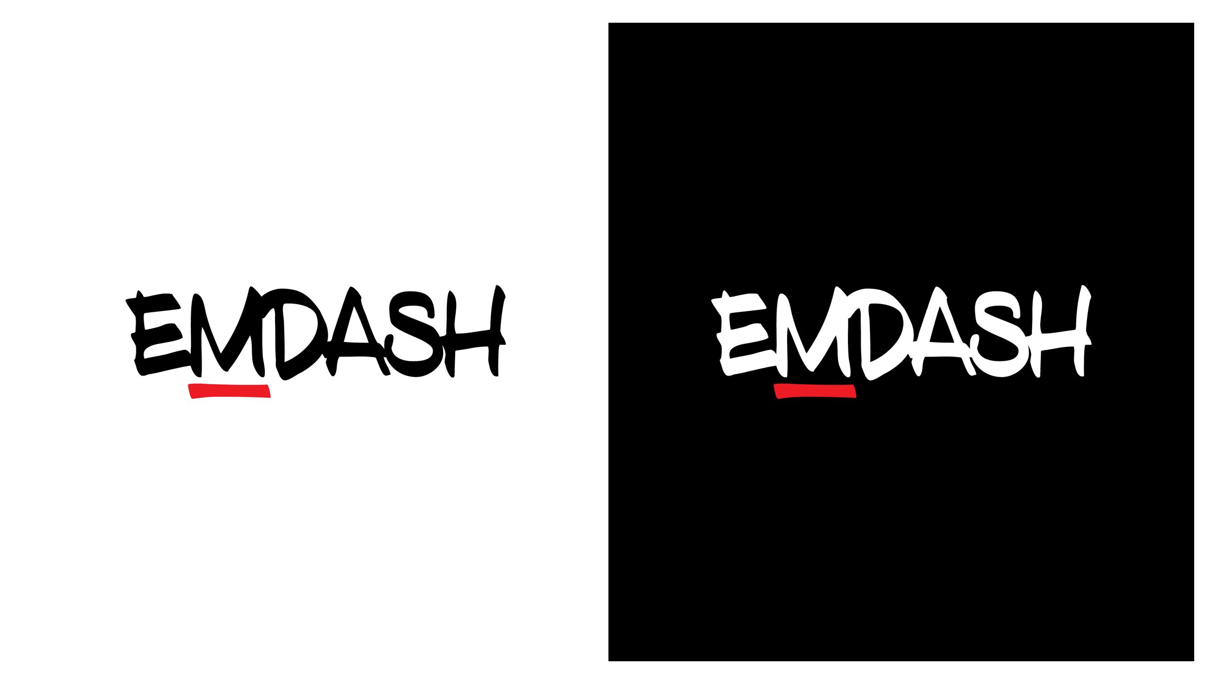
Direction 1: A script or handwriting-based logo that will emphasise the human element/expertise and the act of writing. It can represent the flow of thought in the content/text that Emdash will deliver. Also, it can be seen as exclusive.
The starting point for this project was a logo they had developed.
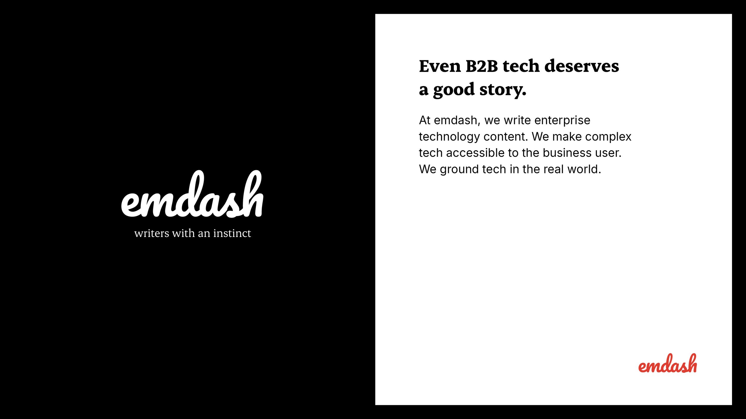
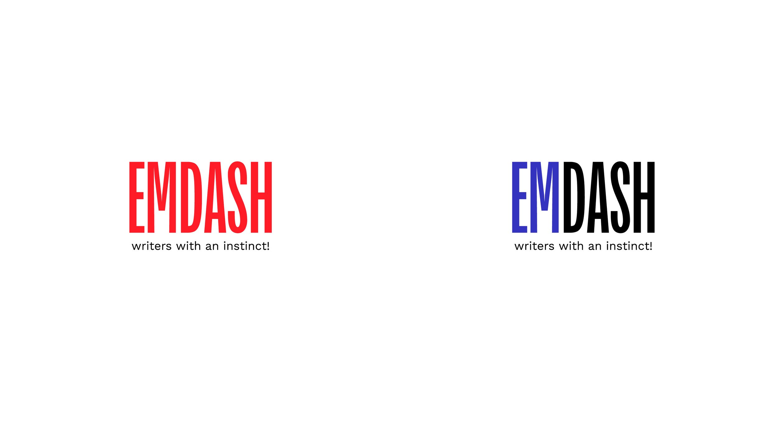
Direction 2: Logo iterations based on their version (Uppercase, sharper edges, use of the dash below M)
Exploring Direction 1 further / Notes:
+ Handwritten font emphasises the human side of the agency and helps bring out the instinct (the act of writing with a bold marker) and expertise in the subject.
+ Fluid thick symbols can be combined and further explored to highlight the strategy + consulting aspect of the business.
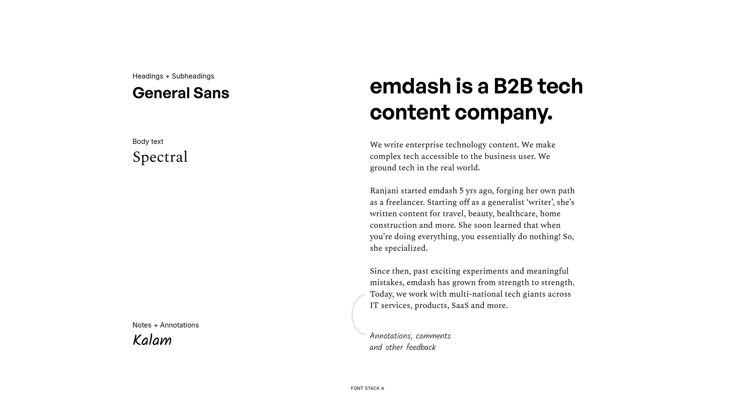
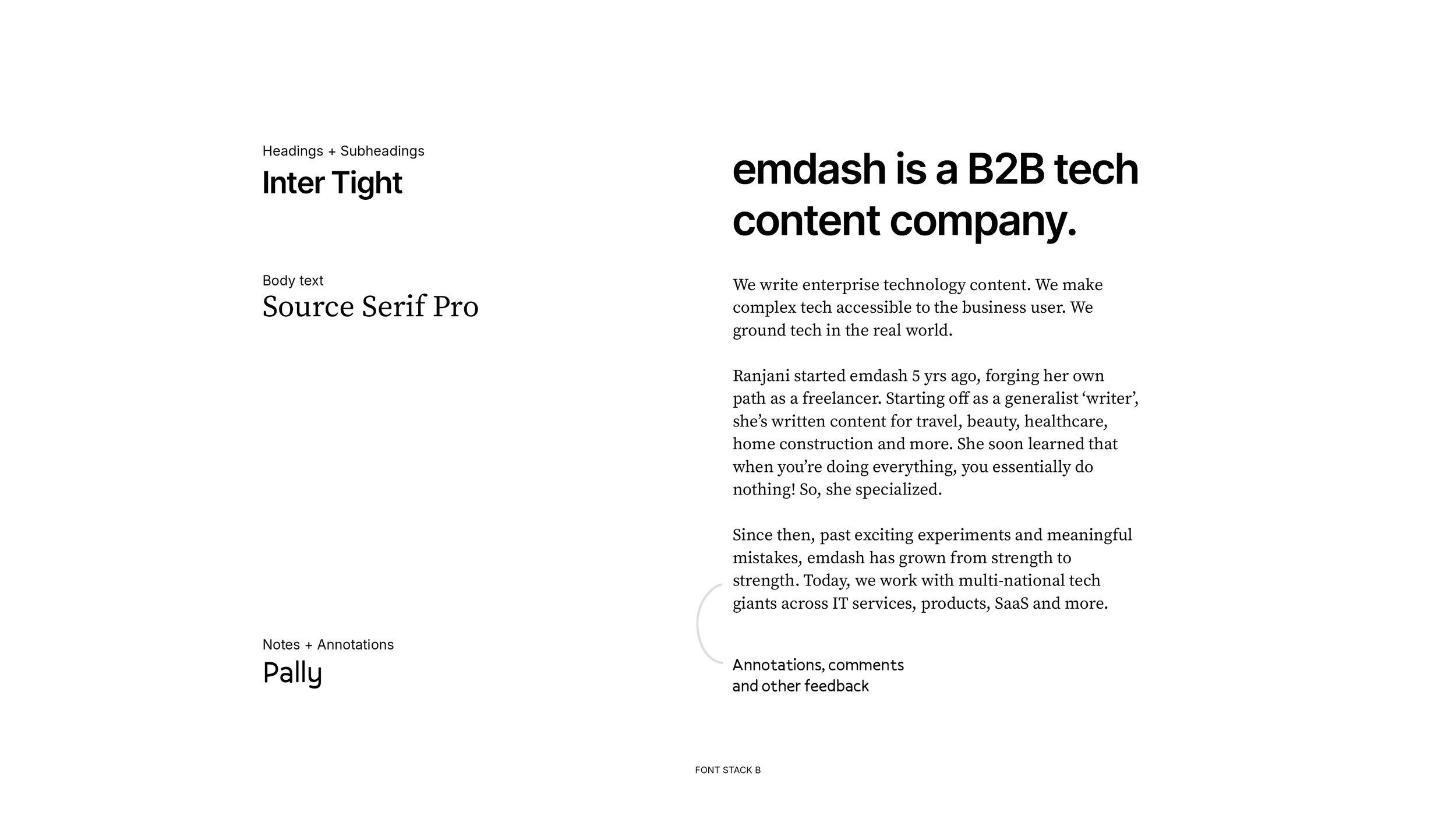
+ Sans-serif heading, Serif body text
+ Incorporating handwriting to bring out a more connected story.
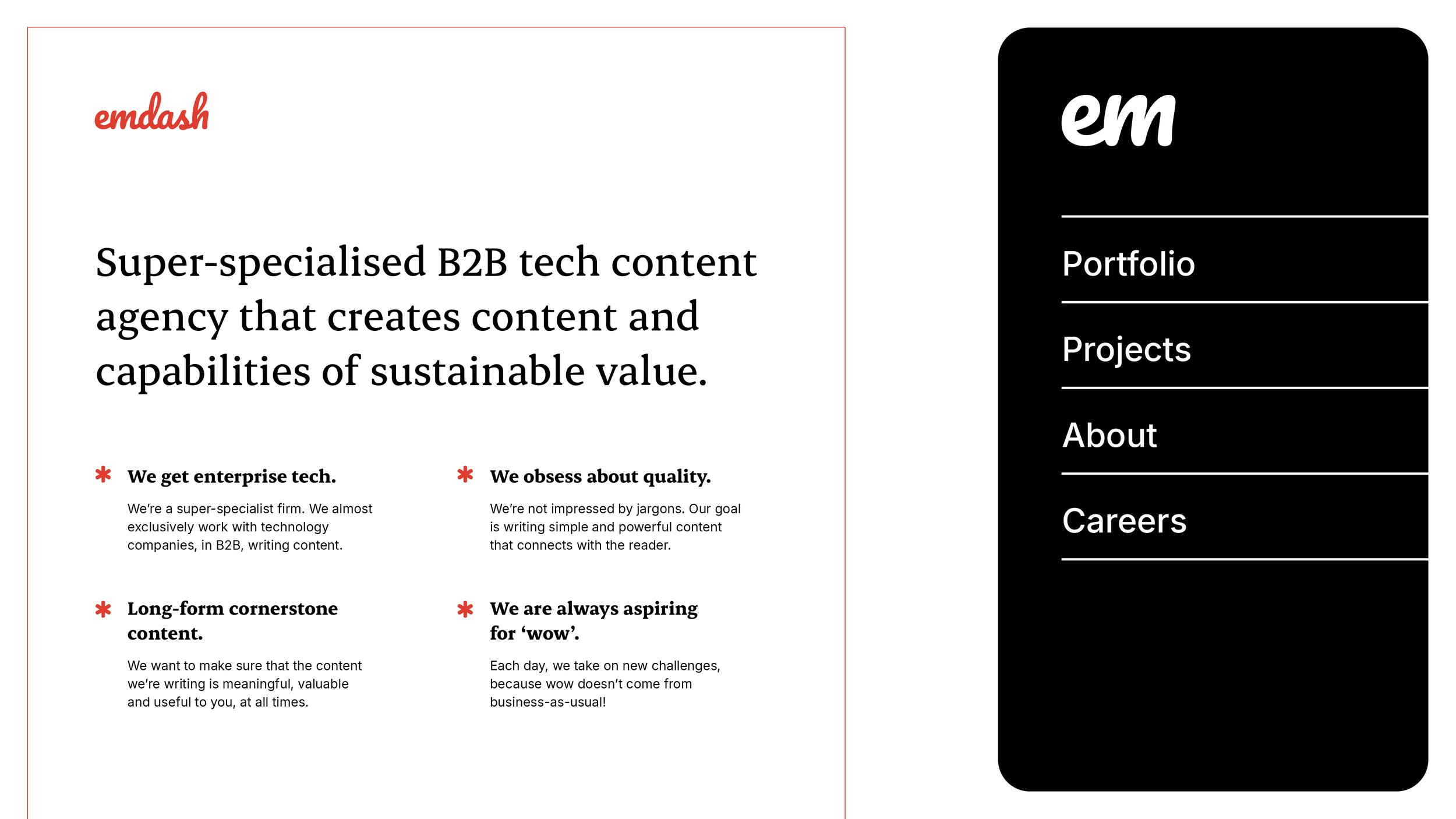
Exploring Direction 2 further / Notes:
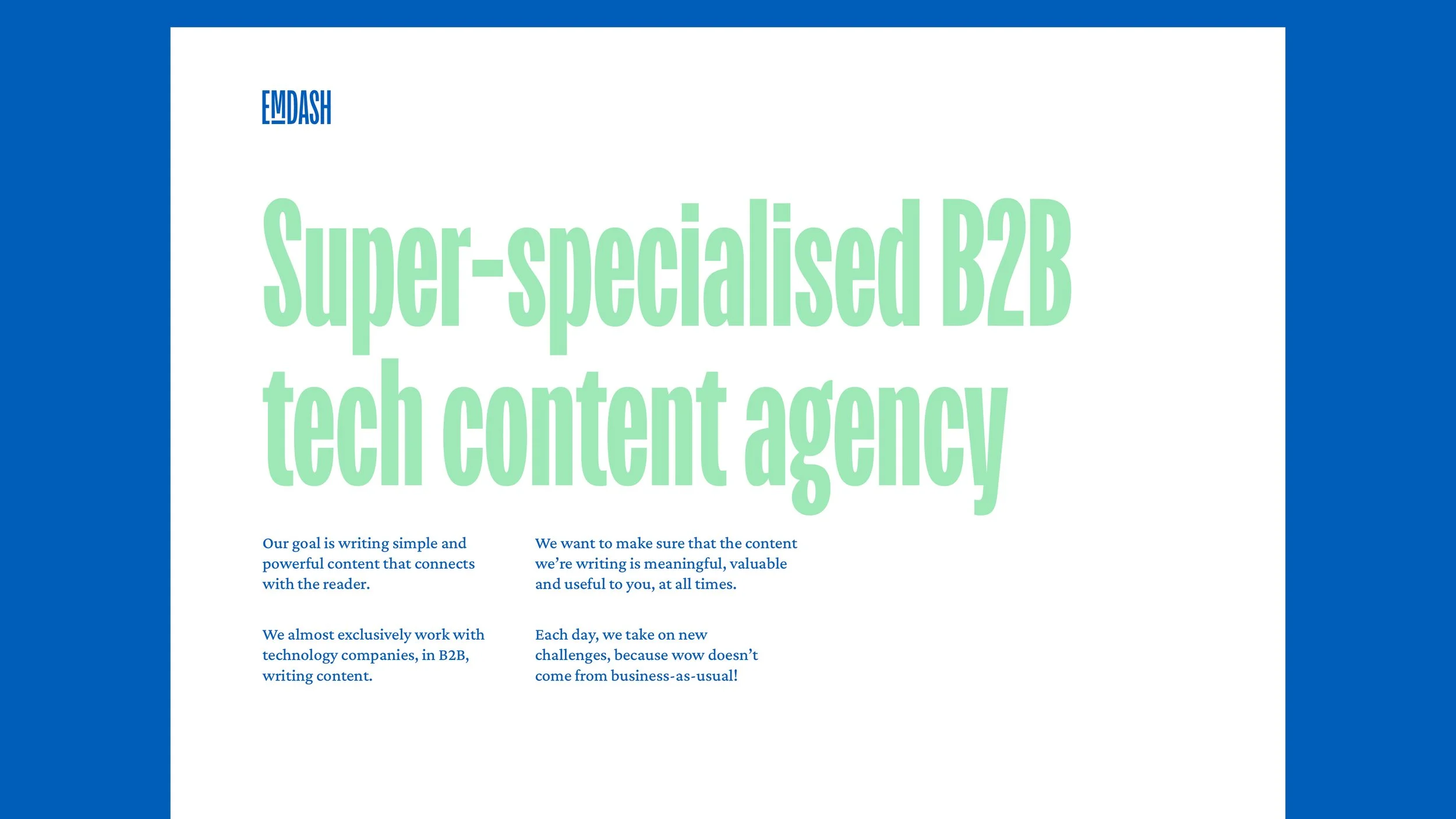
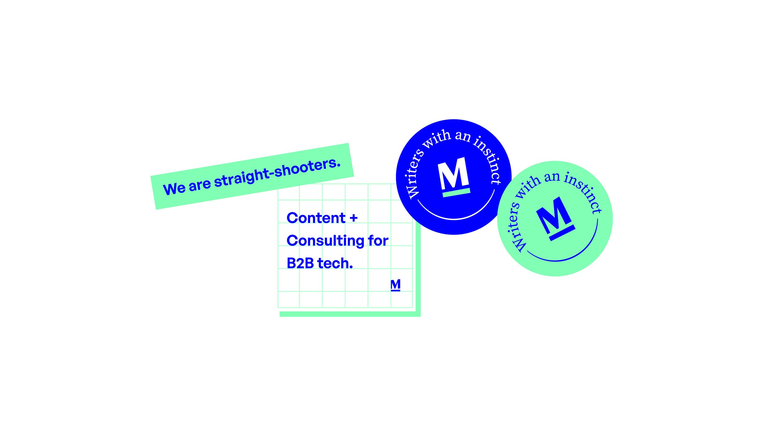
+ Visually representing the growth/conversion or expansion Emdash brings to its customers. This is also emphasised by the use of a green dash under M.
+ Sharp edges, bold letterforms with some contrast and the ‘I have arrived’ feeling.
+ Very clean big headings and a tall x-height serif font like Source Serif Pro.
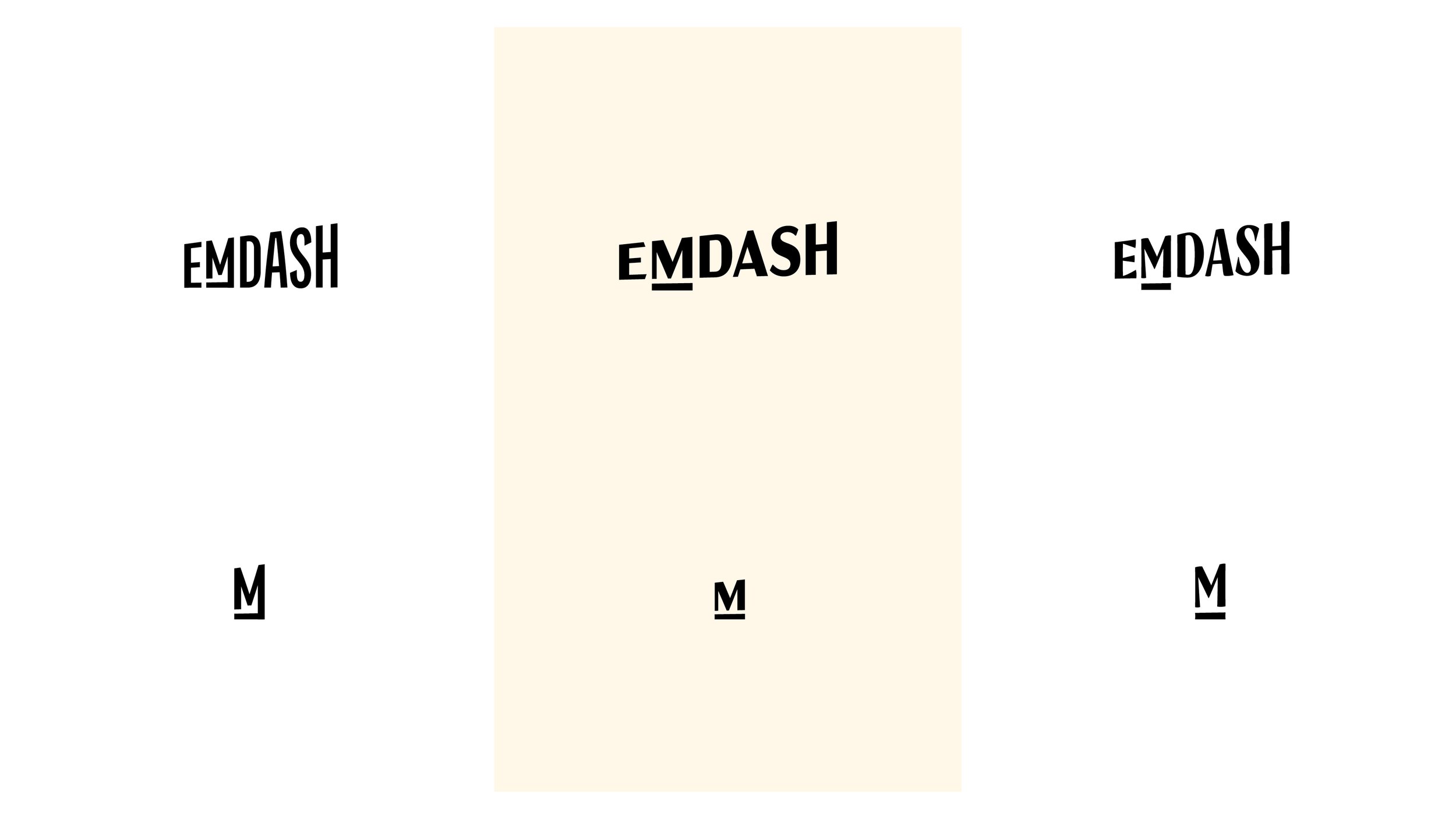
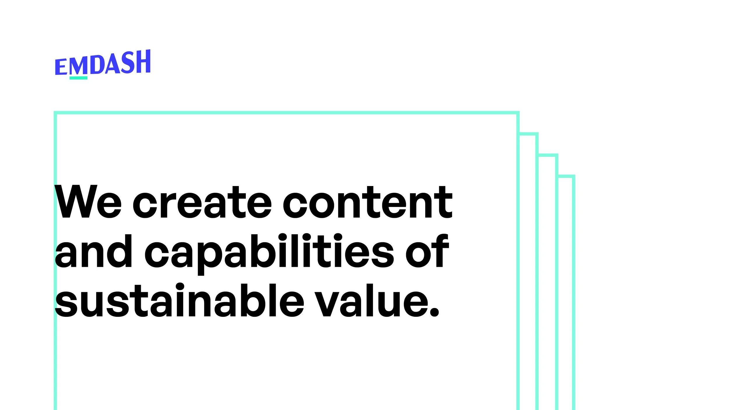
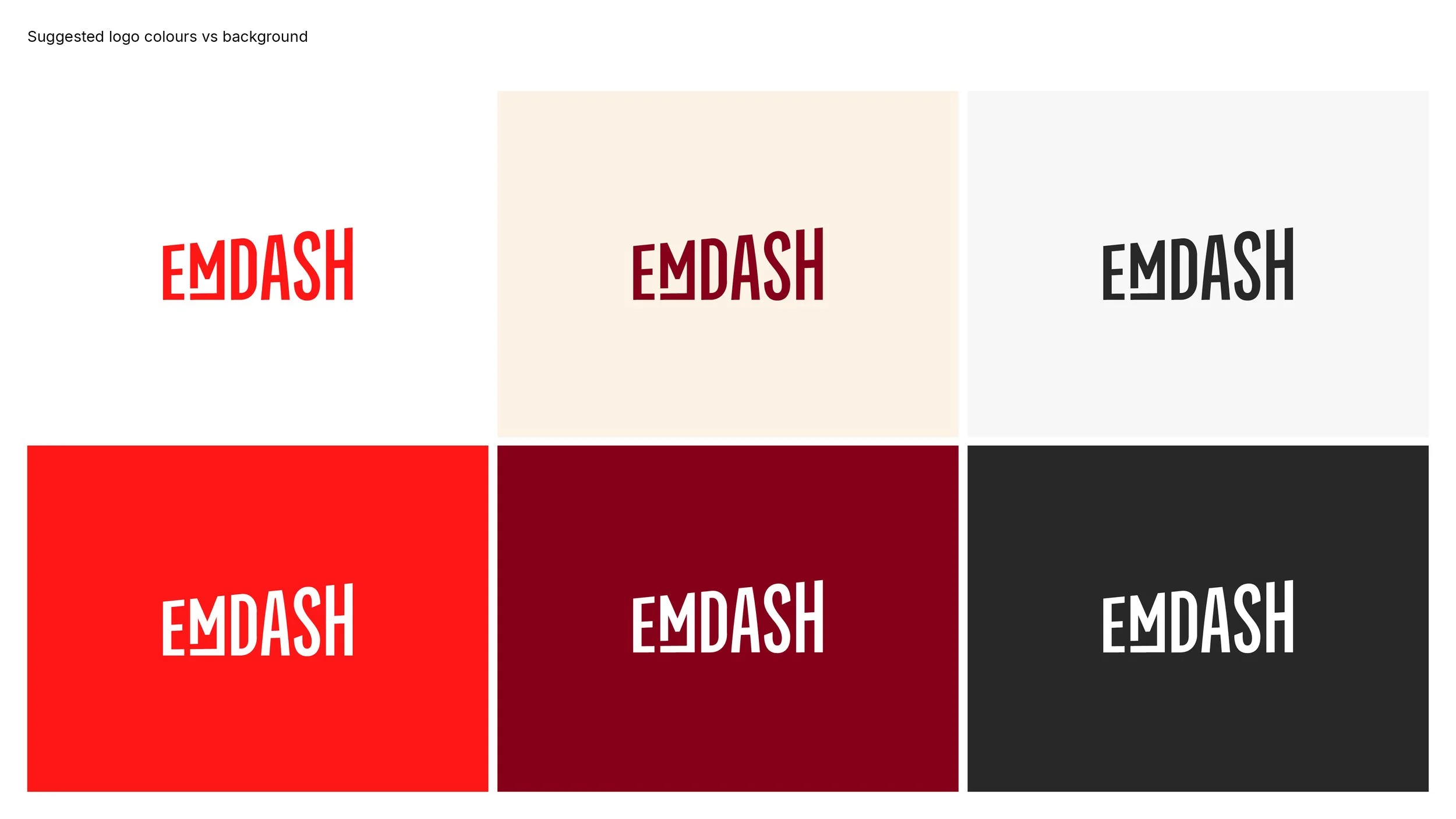
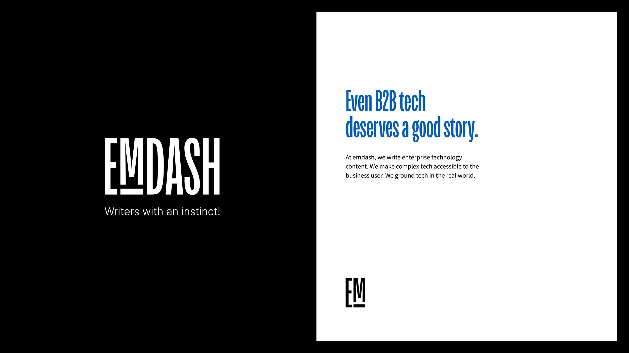
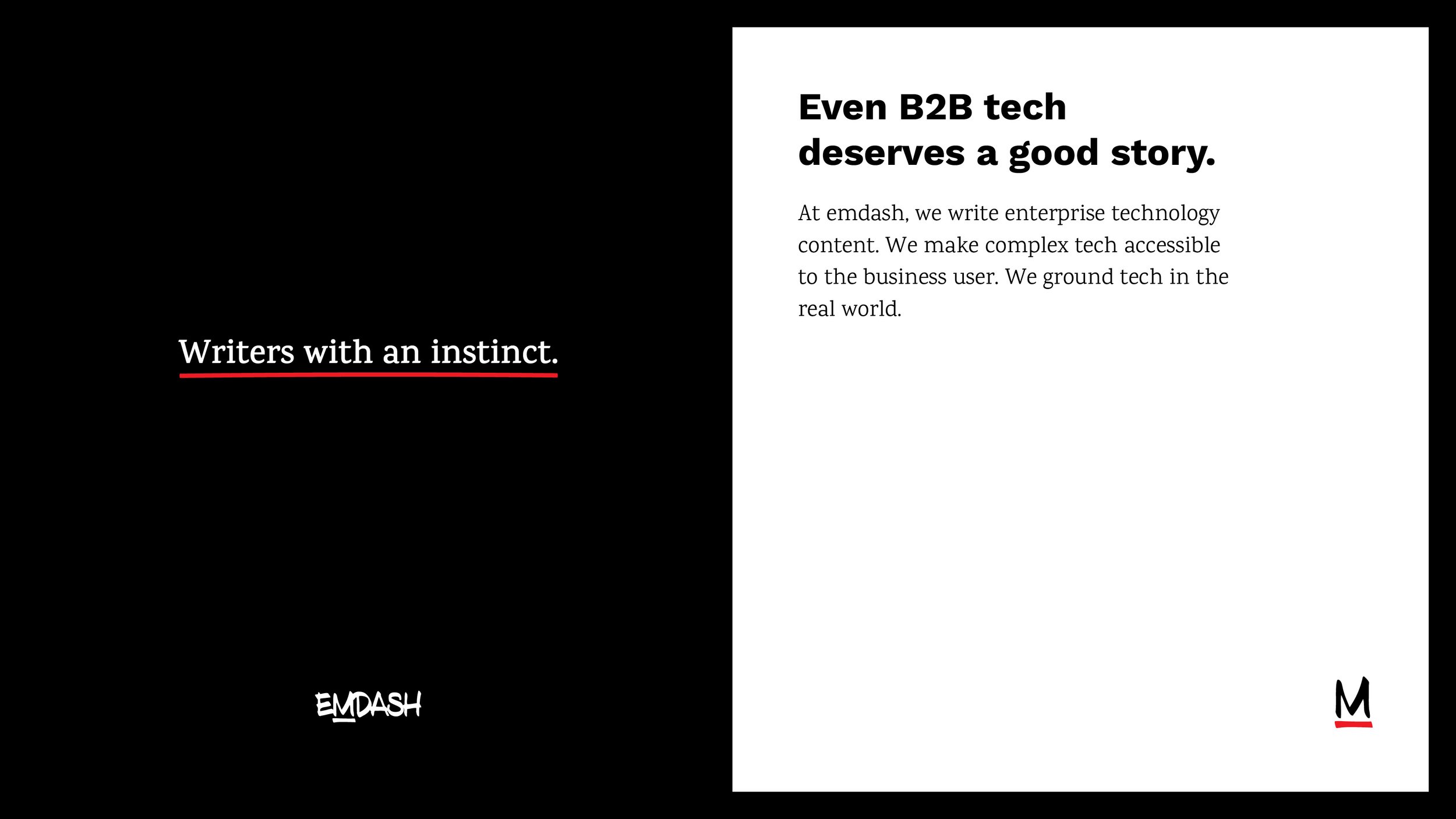
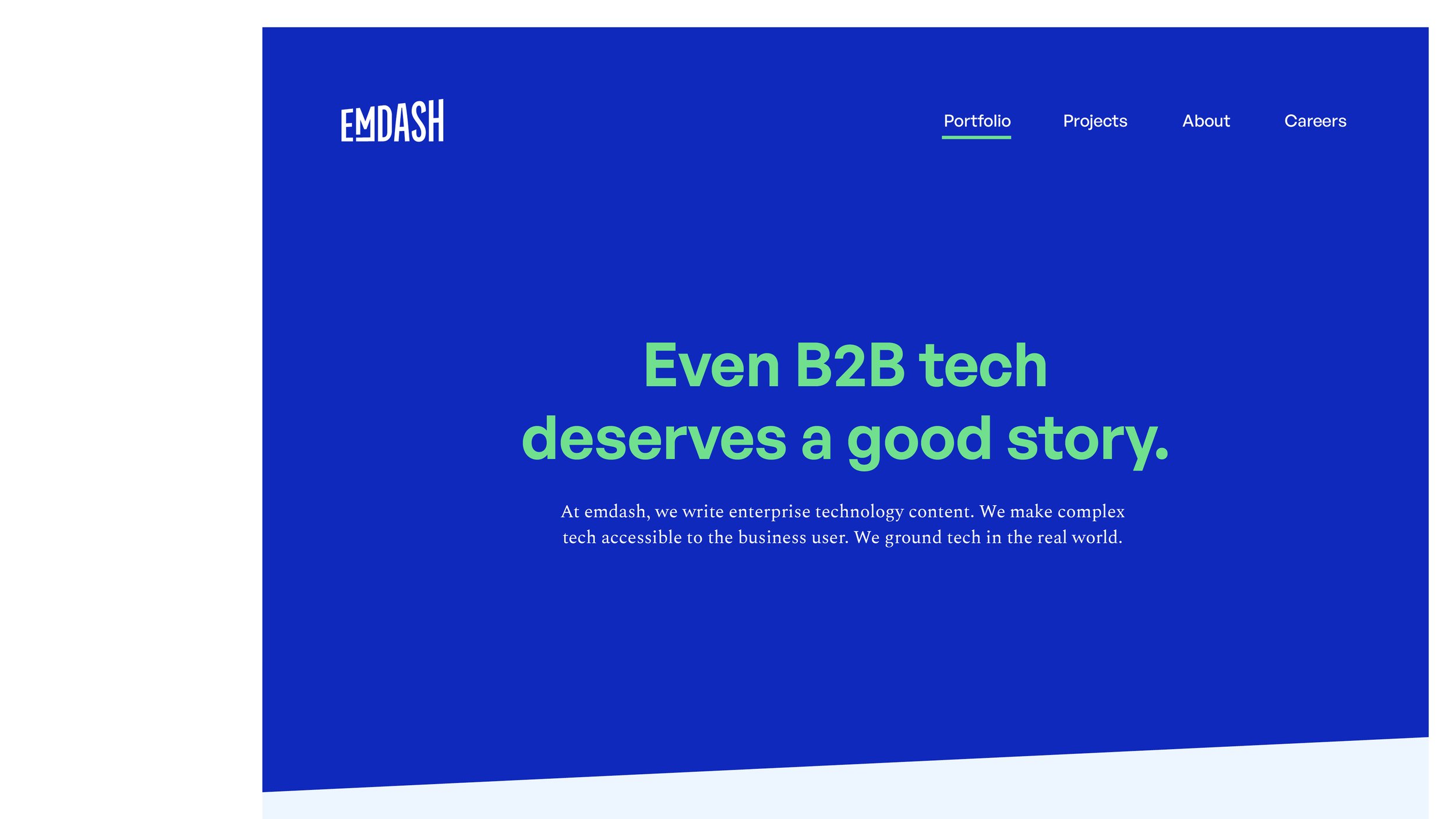
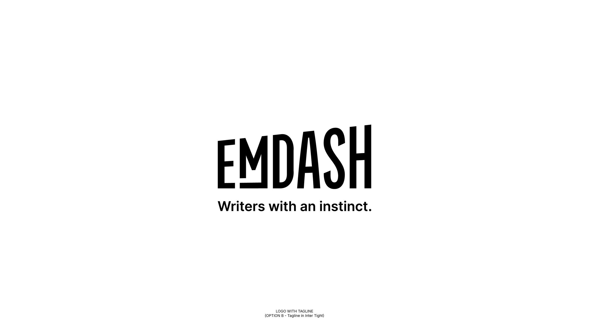
Finalised directions with different colour palettes + font pairings. We moved forward with the option on the right because it felt like a natural transition from the previous emdash logo with teal and greys. It was also a perfect way to balance the electric red.


Old logo
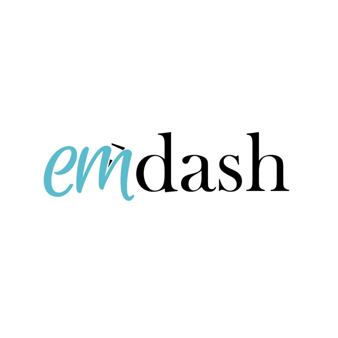
New logo