Flourishing Kids
Making kids fall in love with learning again.
Flourishing Kids fosters the joy of learning, addresses learning difficulties in younger children and, improves student productivity in older children. They offer cohort-based courses for kids (and with parents) and personalised coaching for kids with learning challenges. These courses are location agnostic and designed based on cutting edge research in learning science. Dr V. S. Gayathri, co-founder of Flourishing Kids is a certified counsellor and a practising educational therapist.
My strategy was to make learning appear less academic and more as an activity of joy, in a market saturated with making education competitive. I wanted to position Flourishing Kids as an avenue for children to realise their fullest potential and normalise the idea of consulting an educational therapist.
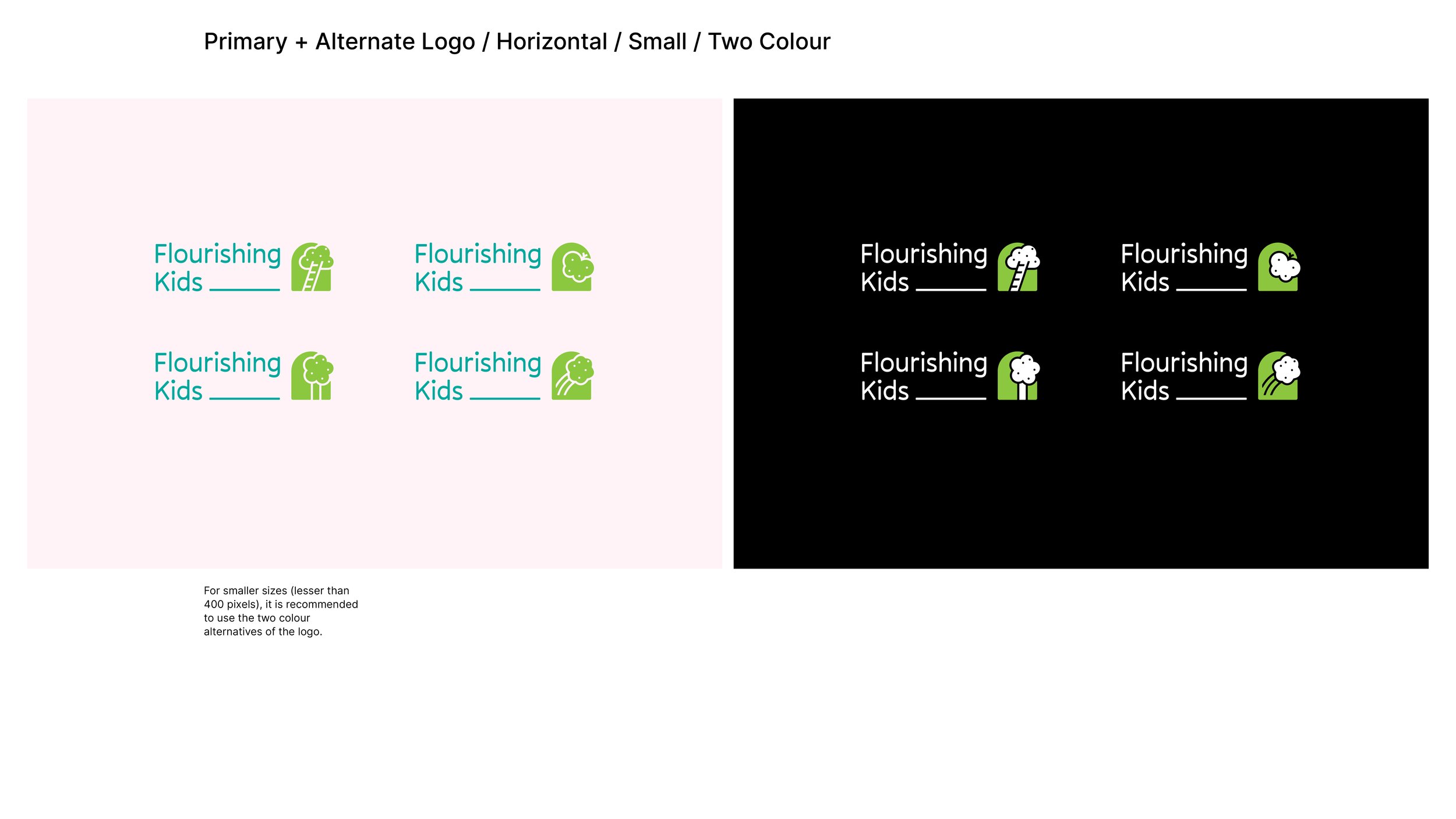
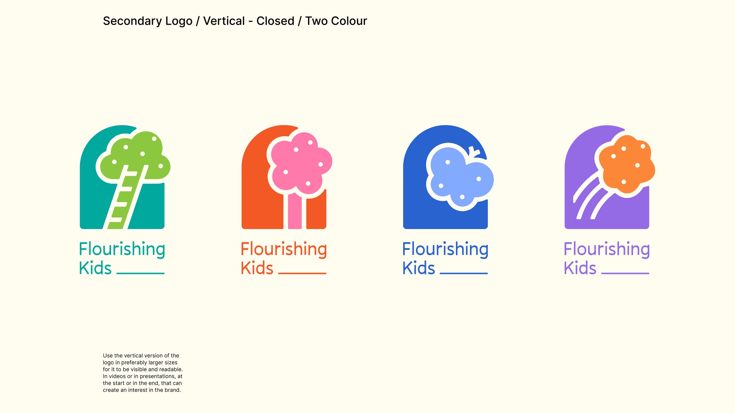
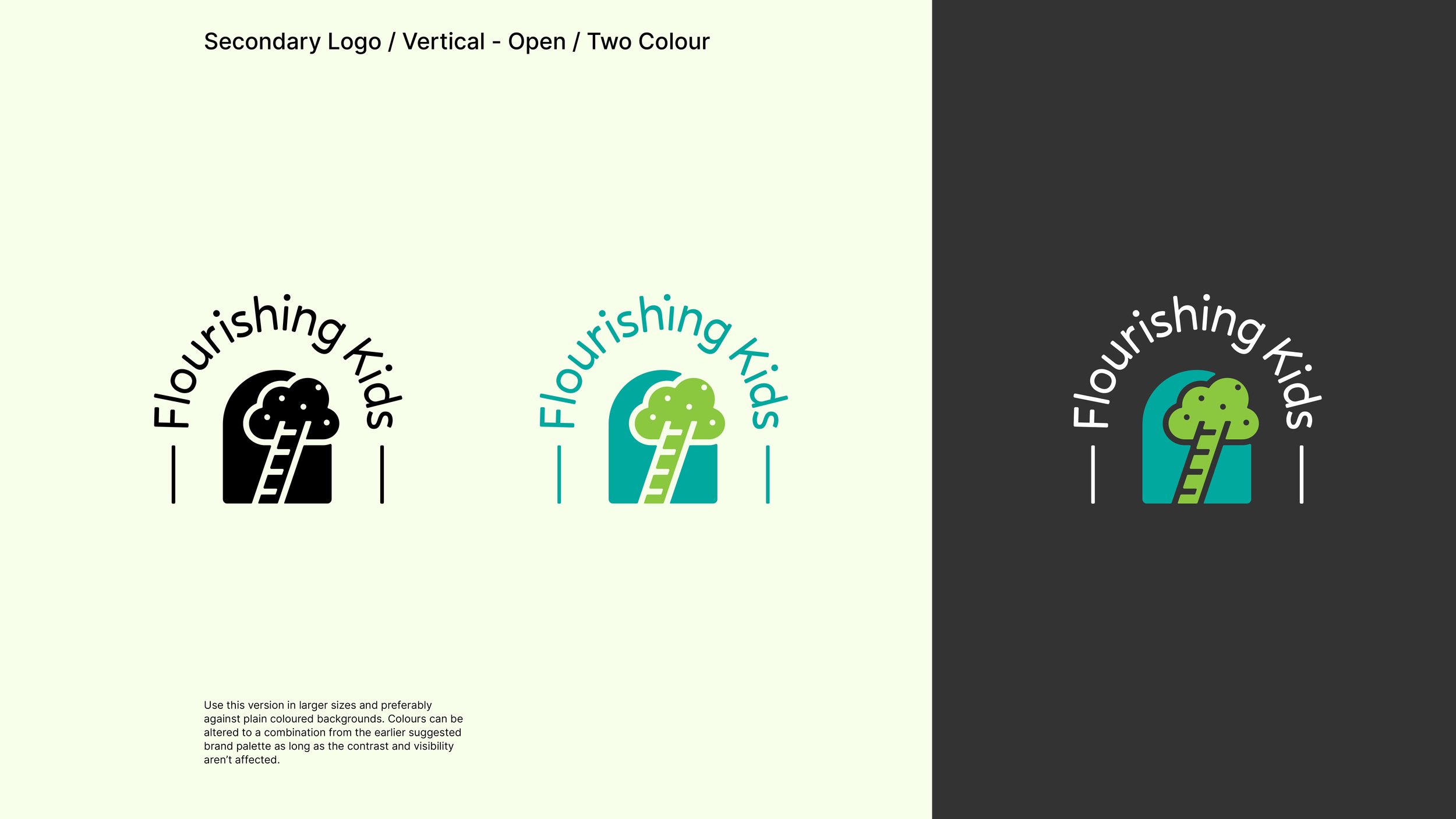
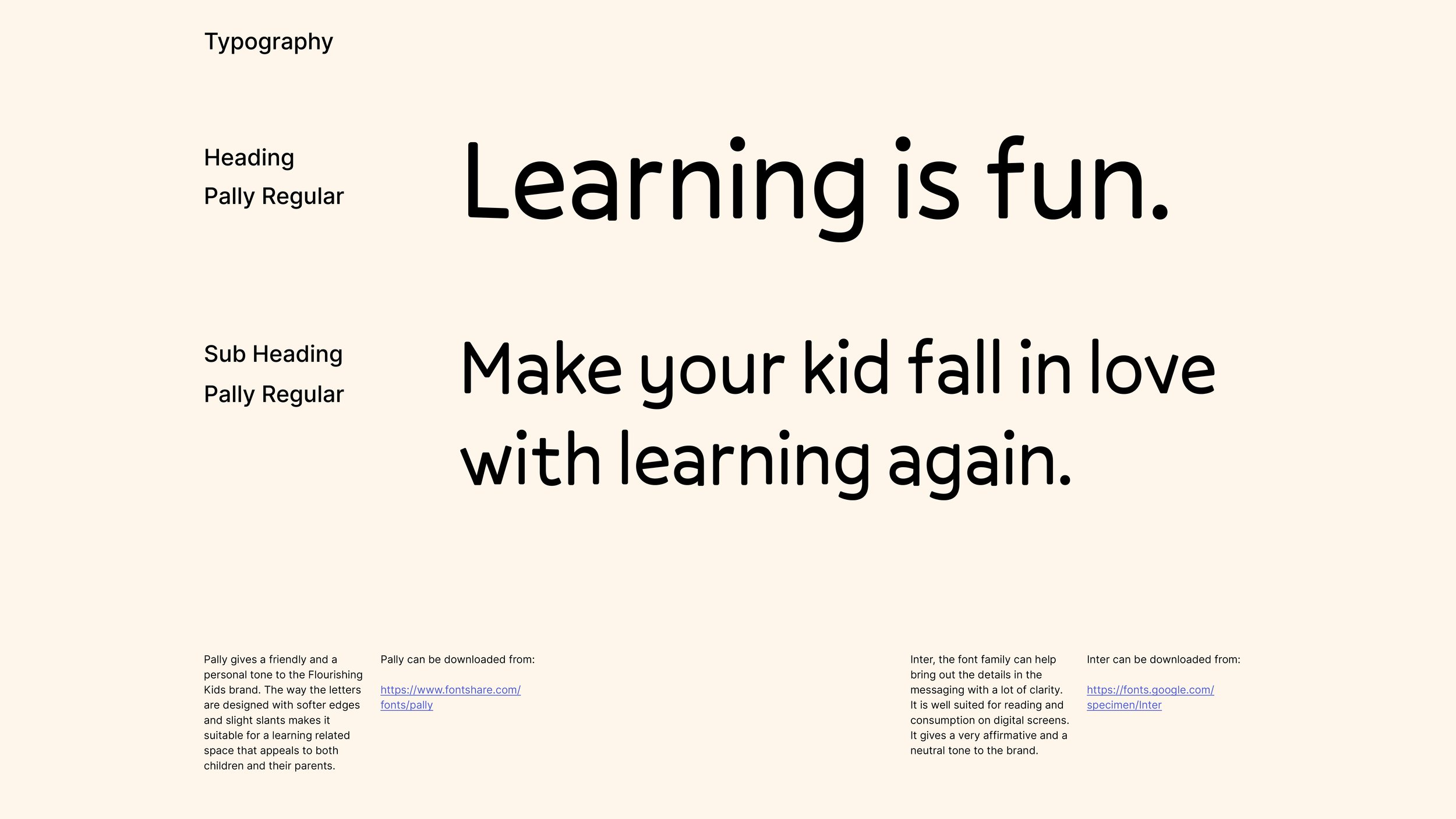
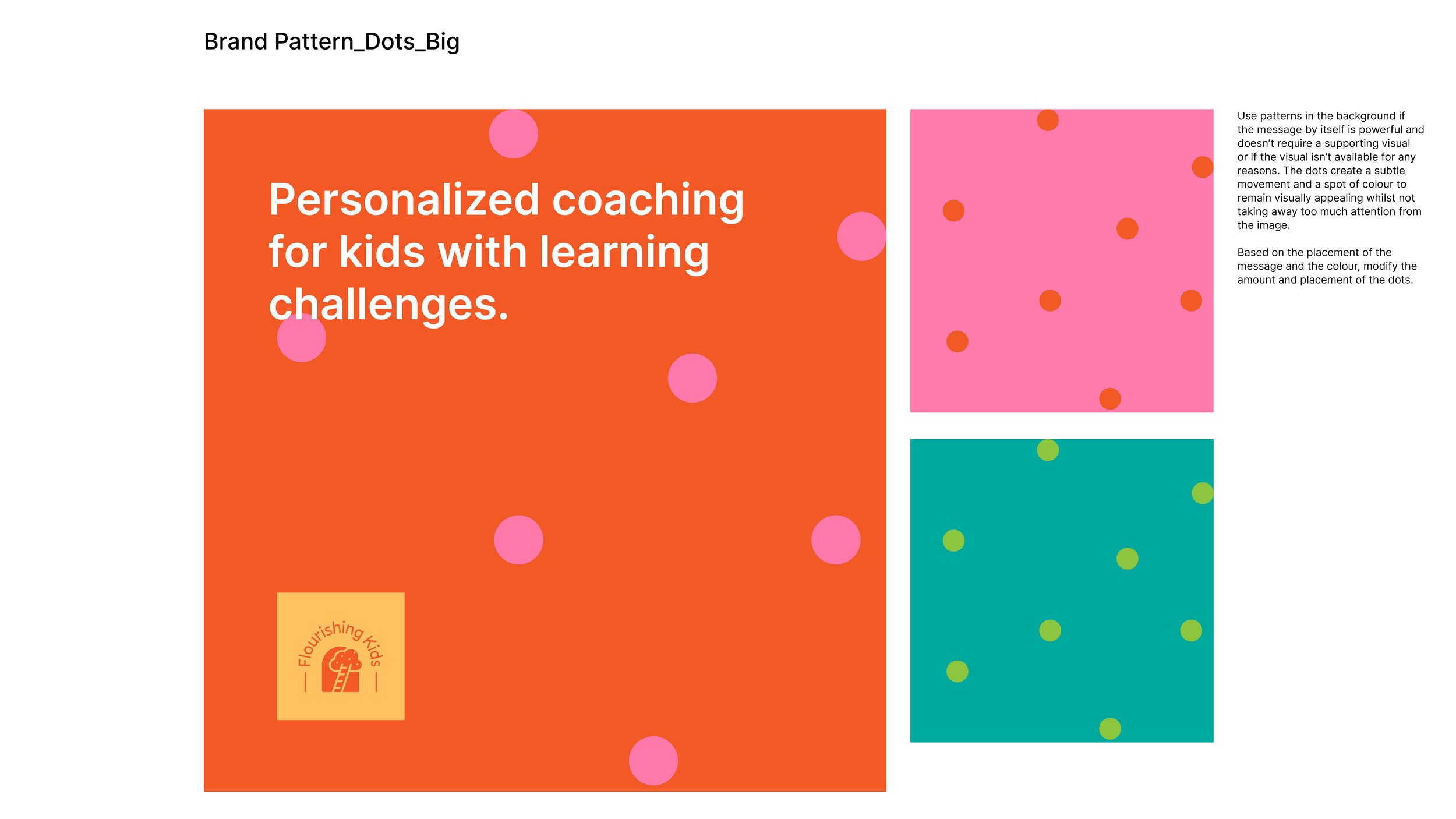
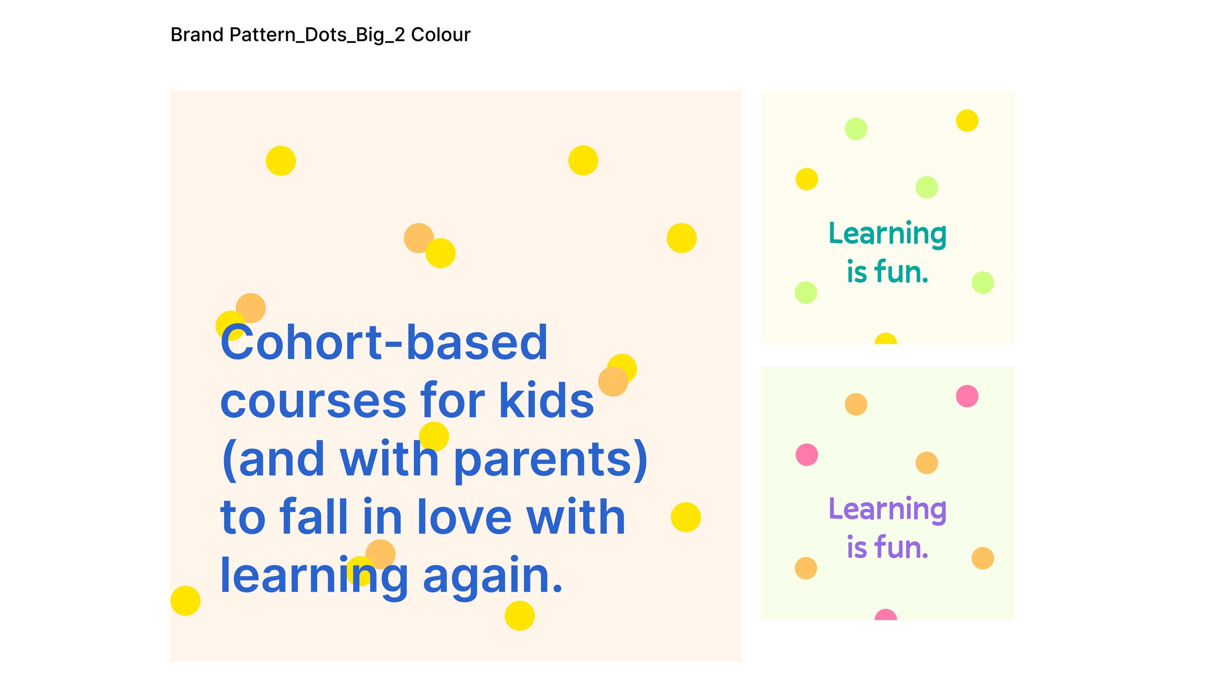
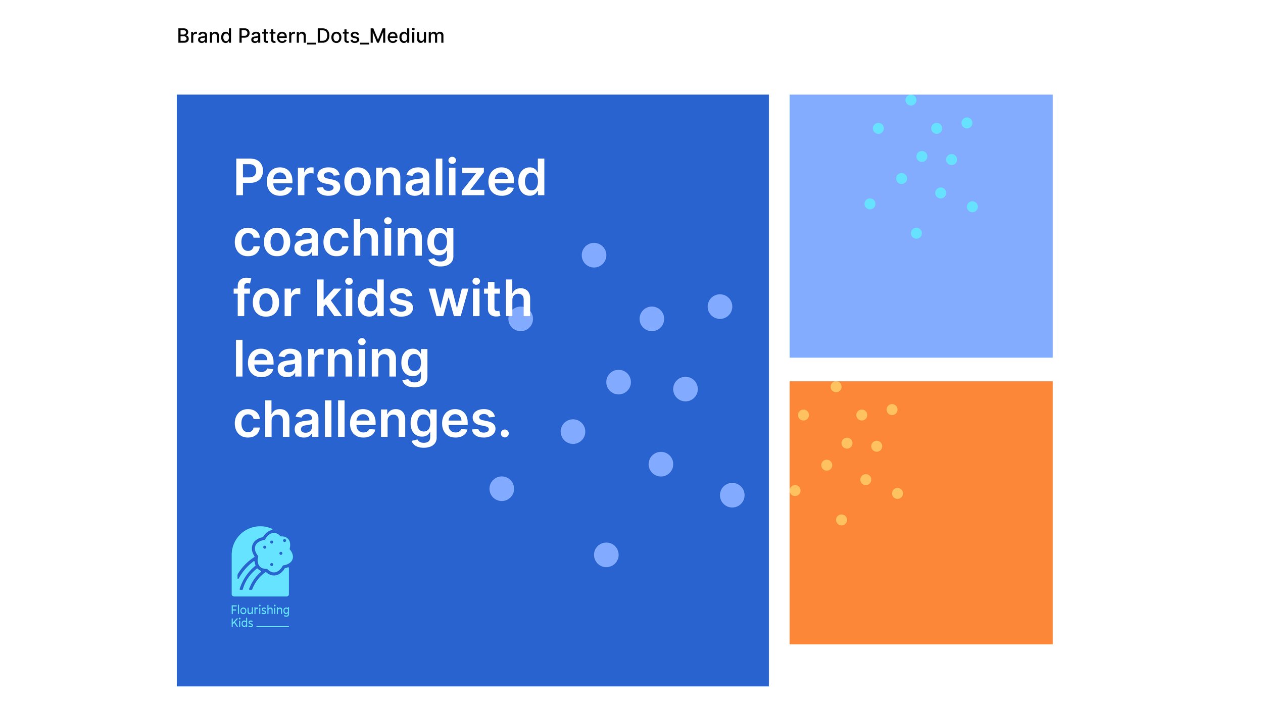
I created a visually engaging and vibrant identity for Flourishing Kids. The brand identity is based on the core idea of flourishing and how this brand complements the traditional education system by filling missing gaps. This is conveyed by the combination of interlocking universal forms associated with growth (like a butterfly, tree, ladder, rainbow) with a window. The little dots add a lively and joyful vibe to the lifelong activity of learning, by learning to learn. I felt Pally (the primary typeface) was well suited for the brand in bringing out the personal nature of their service. The likeness of a child’s handwriting also gave the messaging a friendly tone.
Services:
Logo & Identity
Branding
Illustration
Social Media Templates
Client:
Dr. V. S. Gayathri
Founder, Flourishing Kids
Year: 2021-22
Ideation and logo development

Starting point of the rebranding done for Flourishing Kids.
Pencil sketches created for the first round of iterations. Each option was numbered and presented with the core idea(s) it represents, to make it easier for the client to pick the ones they favour.
Based on the options we narrowed down from the first round, I worked on three directions we could proceed with.
Direction 01 is a dynamic logo concept, where the logomark placed at the end signifies the end outcome of being a part of Flourishing Kids. The idea was to have multiple logomarks that can be a part of the brand and used to denote different cohorts or stages of learning. The use of dots brought out the liveliness of the brand and the feeling of shining/excelling.
Direction 02 is a modification of the earlier direction but it was visually more resolved compared to the earlier one. The addition of a window form to the logo made it more meaningful, consistent and solid. Flourishing Kids could now be seen as a place that opens up more opportunities for children with or without learning difficulties. This is the direction we decided to proceed with.
With Direction 03, I wanted to create a playful and modular logo based on building blocks and growth, to bring out the idea that learning is fun. Though it had many possibilities of showing assisted learning and growth, we decided not to move ahead in this direction.
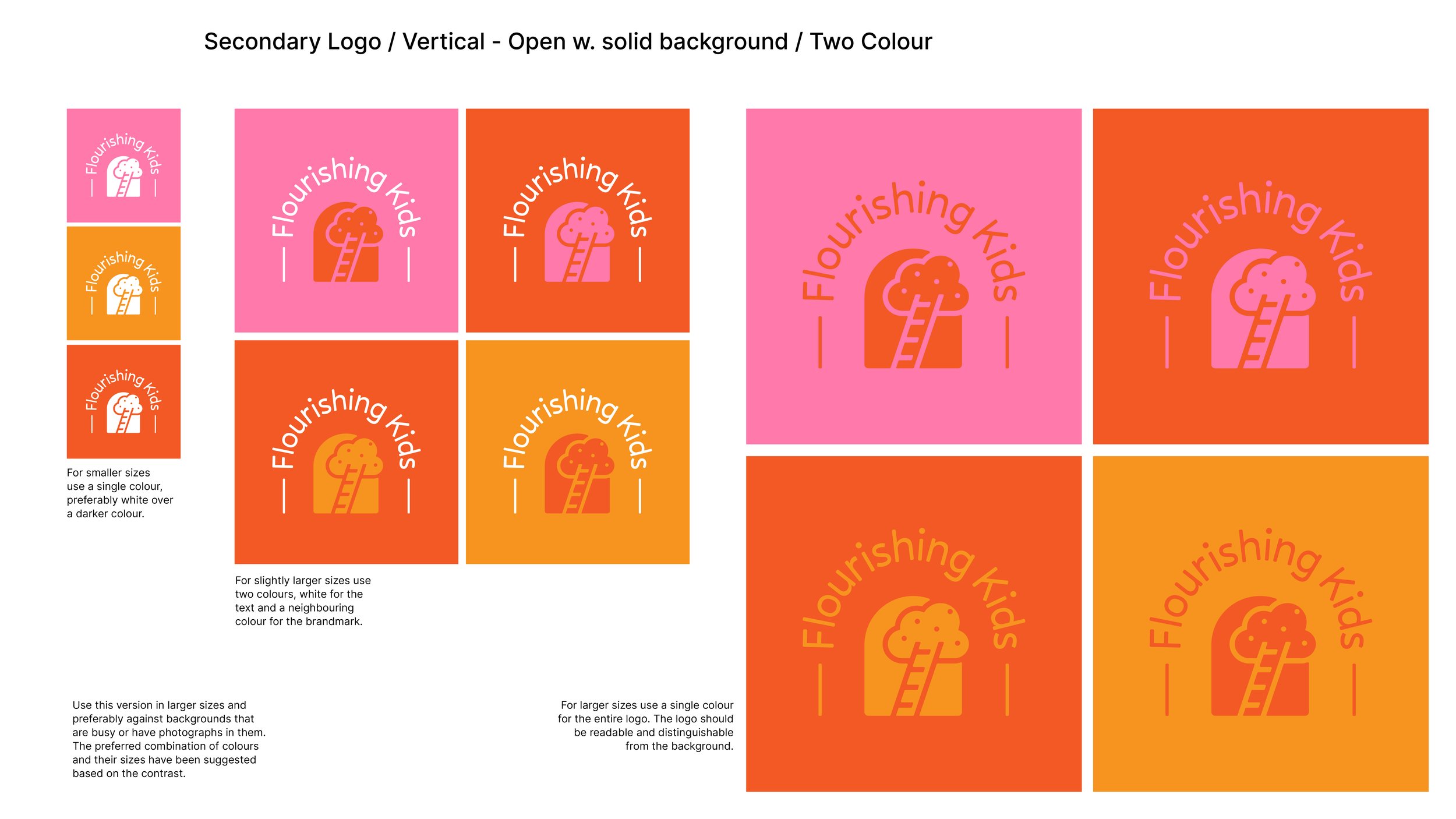
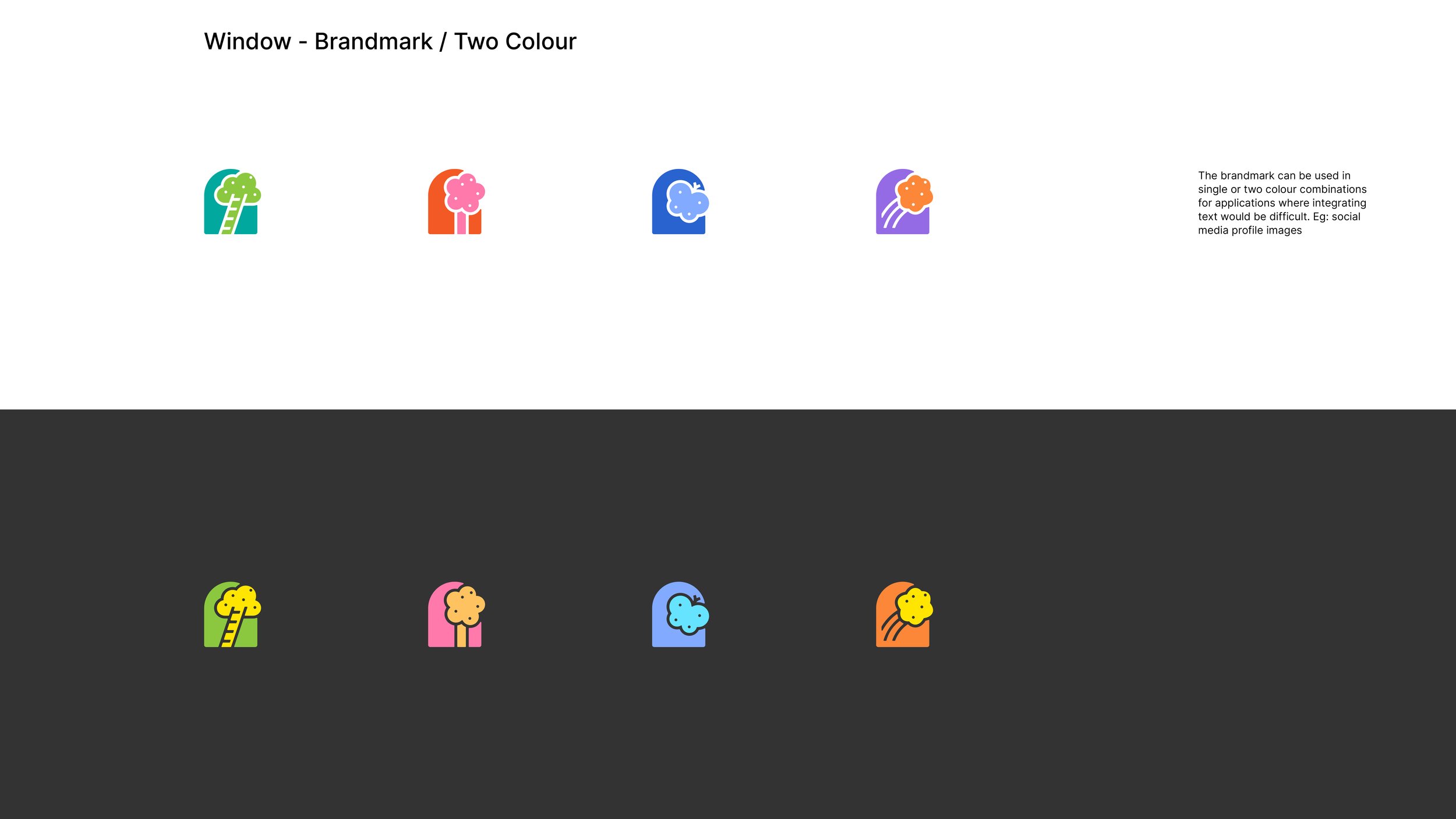
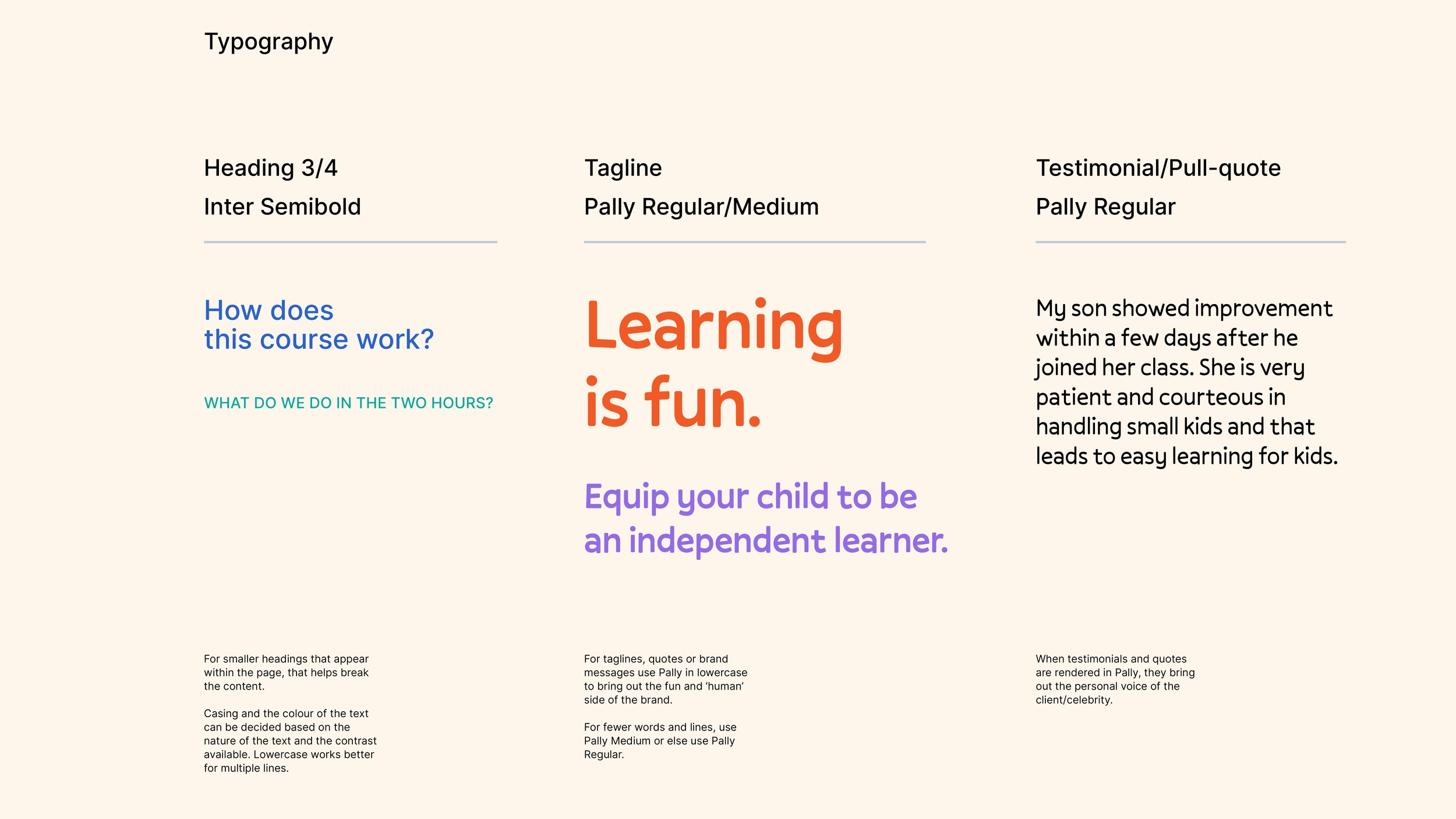
Brand assets and guidelines


Social media templates
The templates carry a clean and simplified design that would be easy for Dr Gayathri to follow and adapt as she designs them in the future. I imported the logos, shapes, patterns, font families and colour swatches to Canva for her to be able to pick and use. I also shared a guideline with pointers on how to choose a particular aspect ratio, breaking down content into smaller chunks and other inputs.


Website illustrations
Hero illustration depicting how Dr Gayathri facilitates learning and development through program.

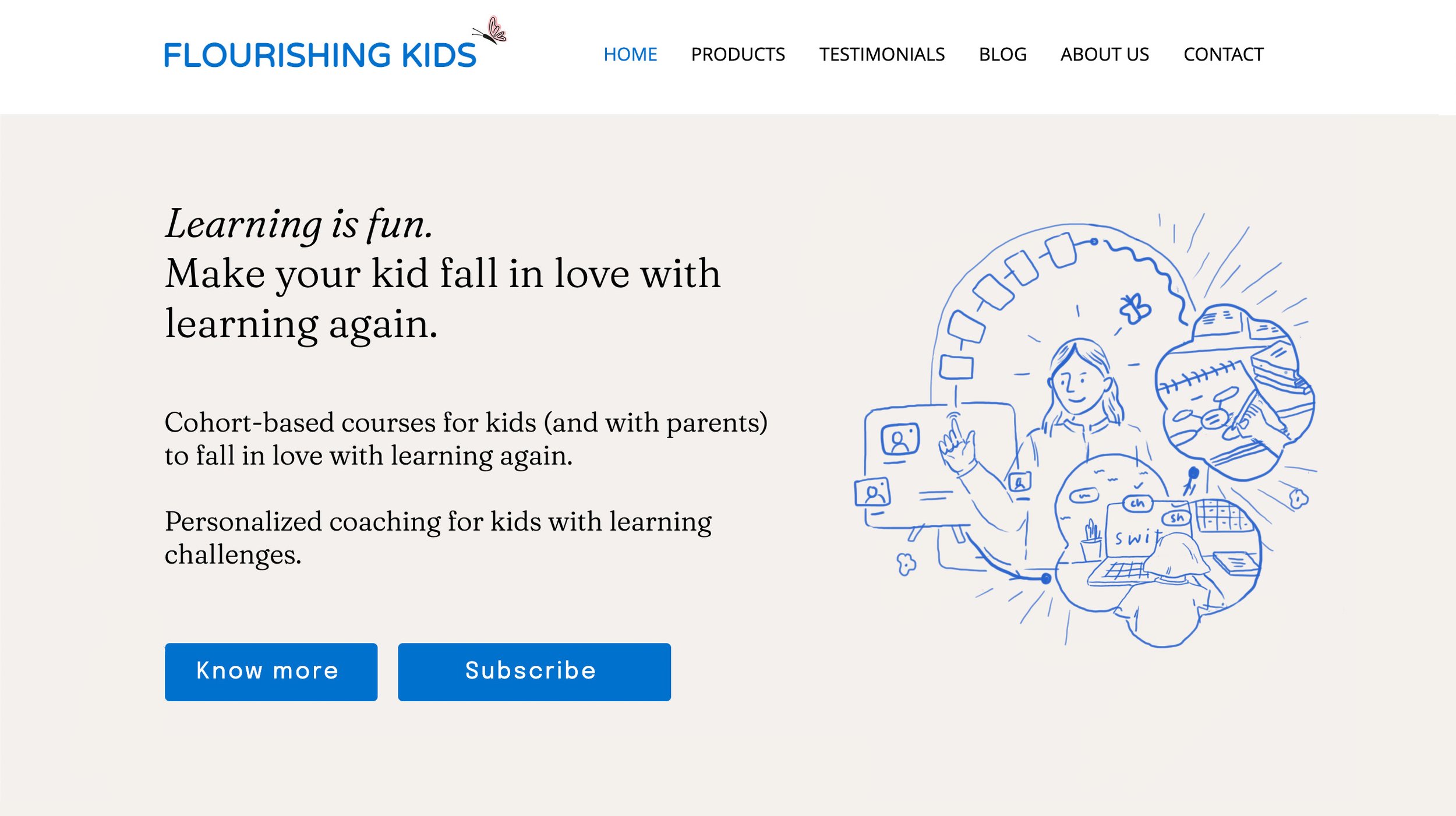
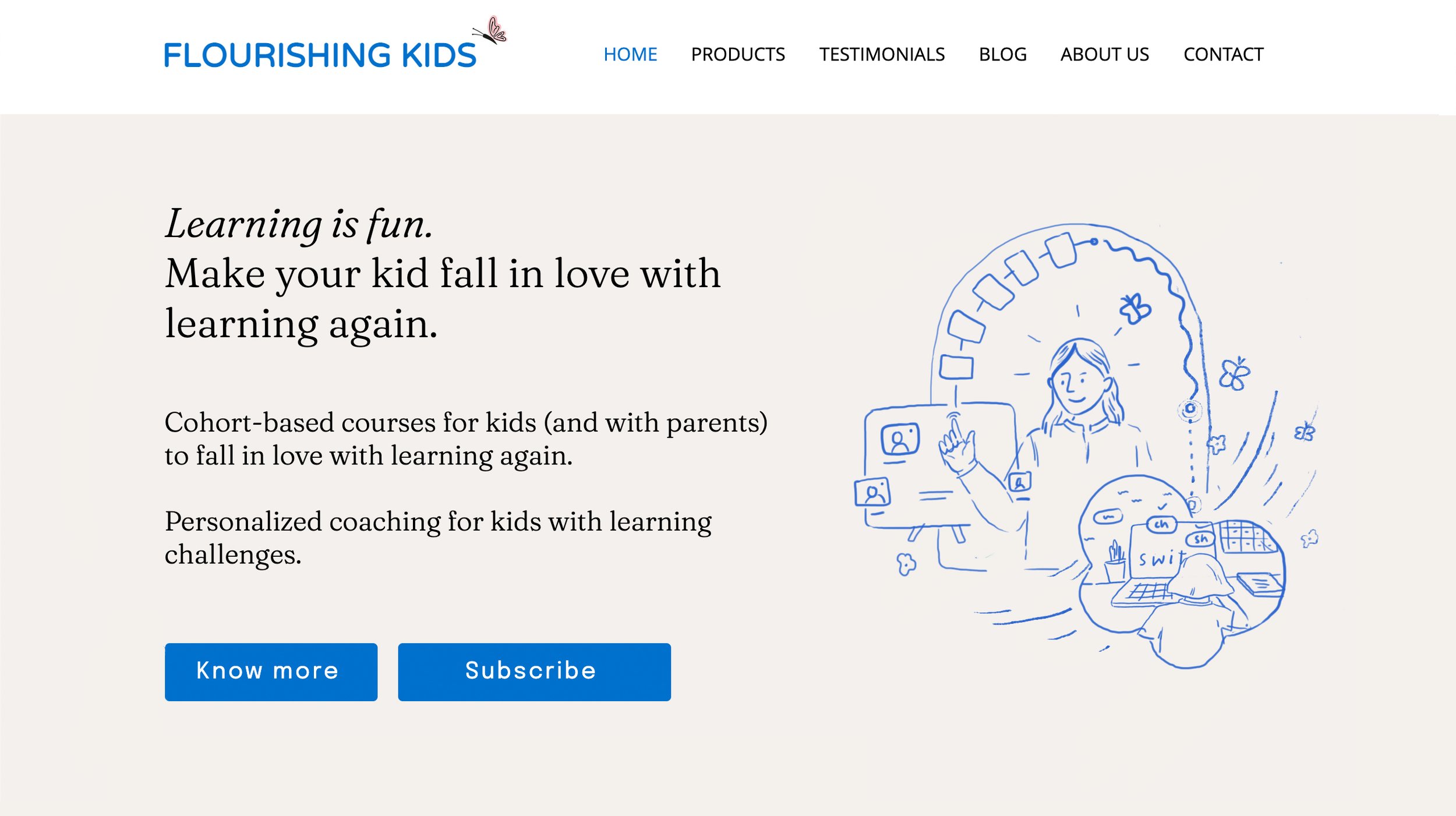

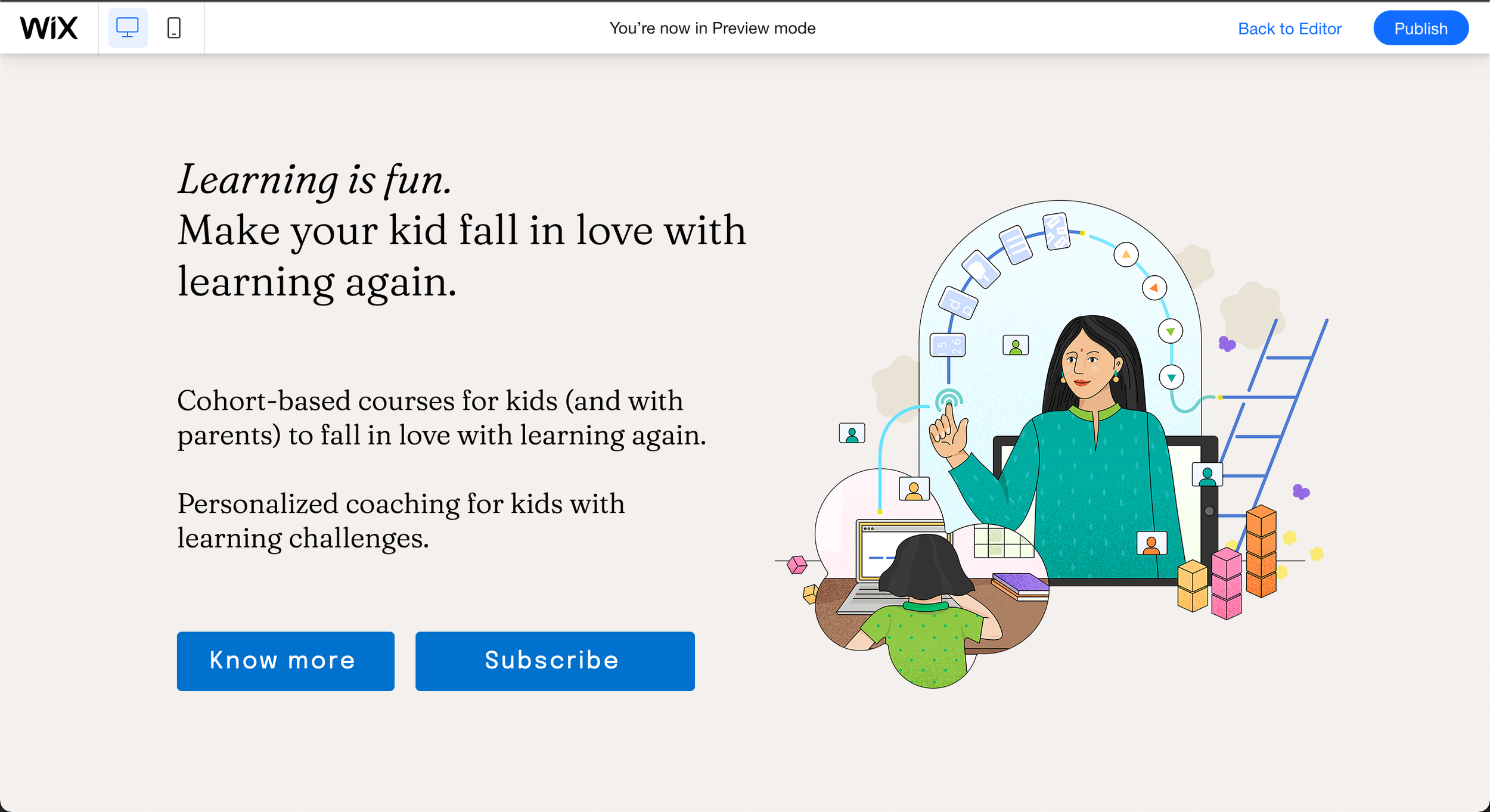

Illustration depicting the philosophy behind Flourishing Kids

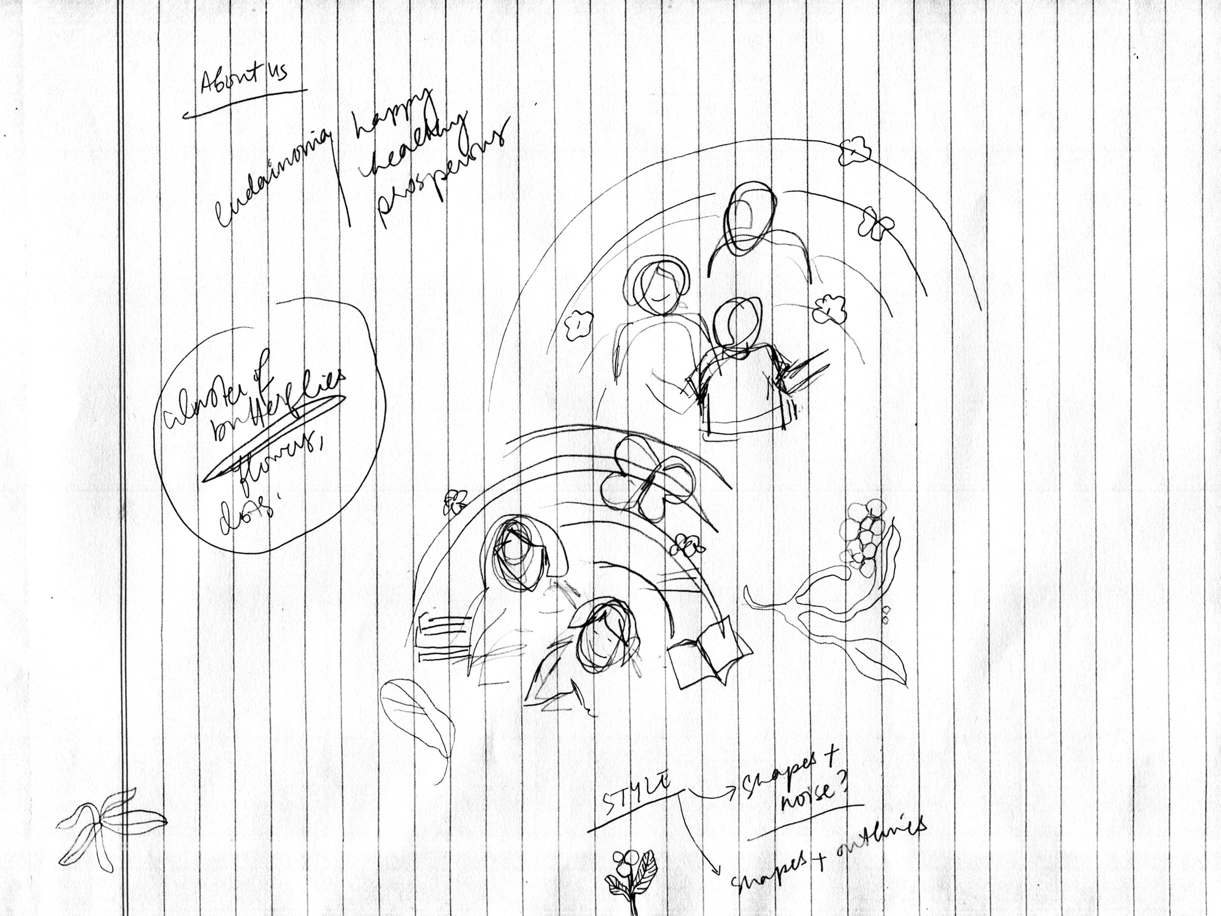
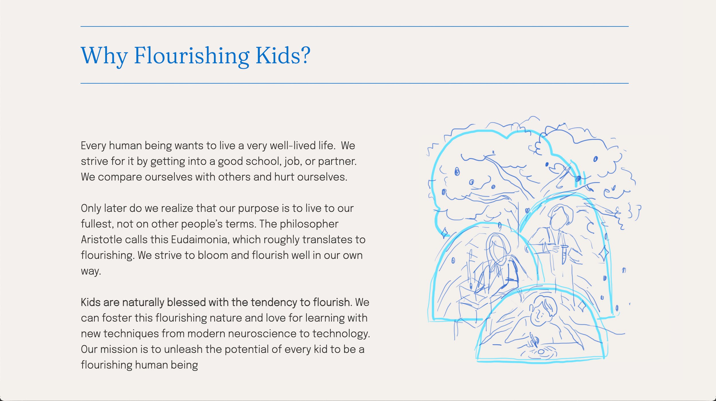
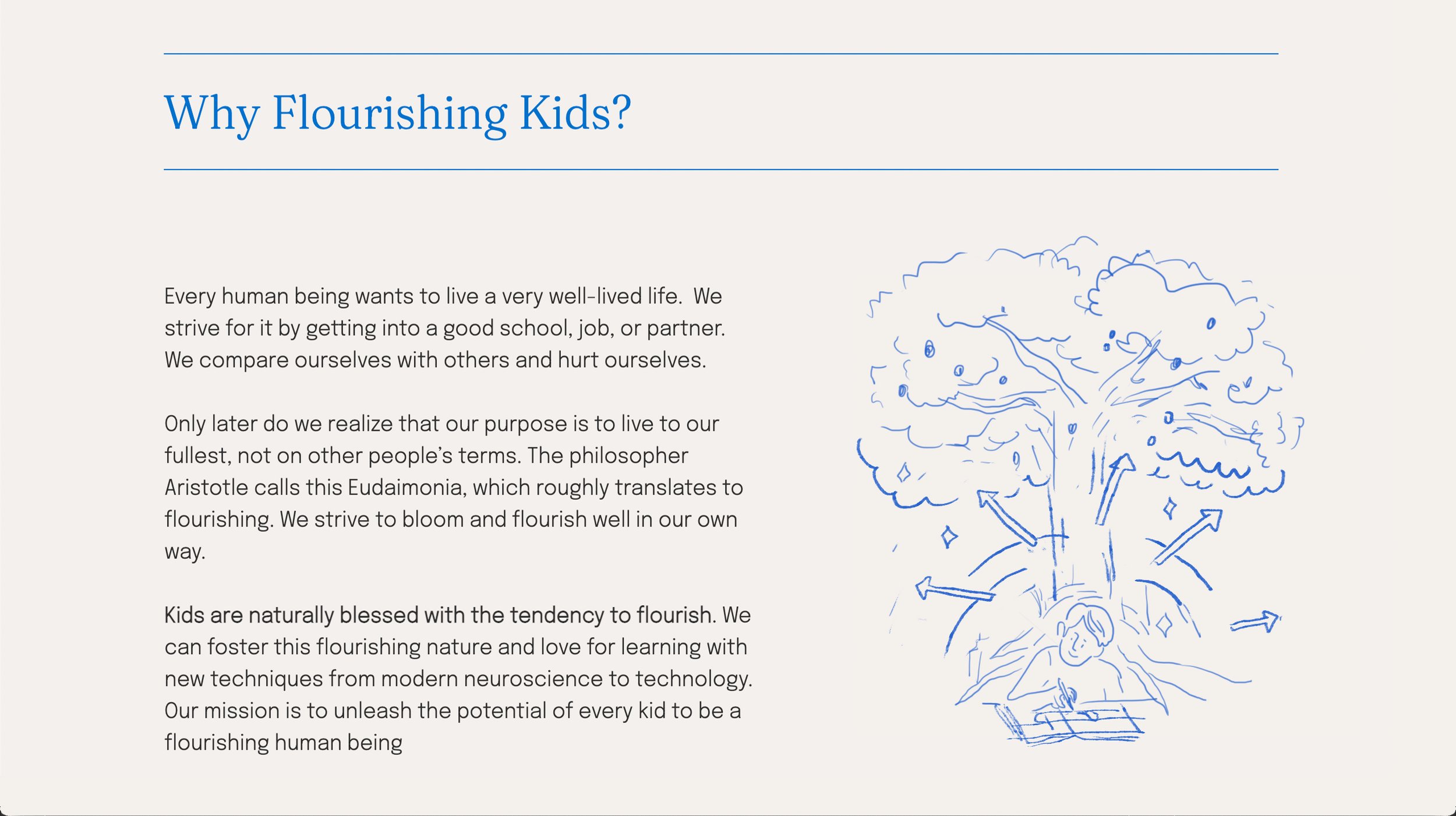
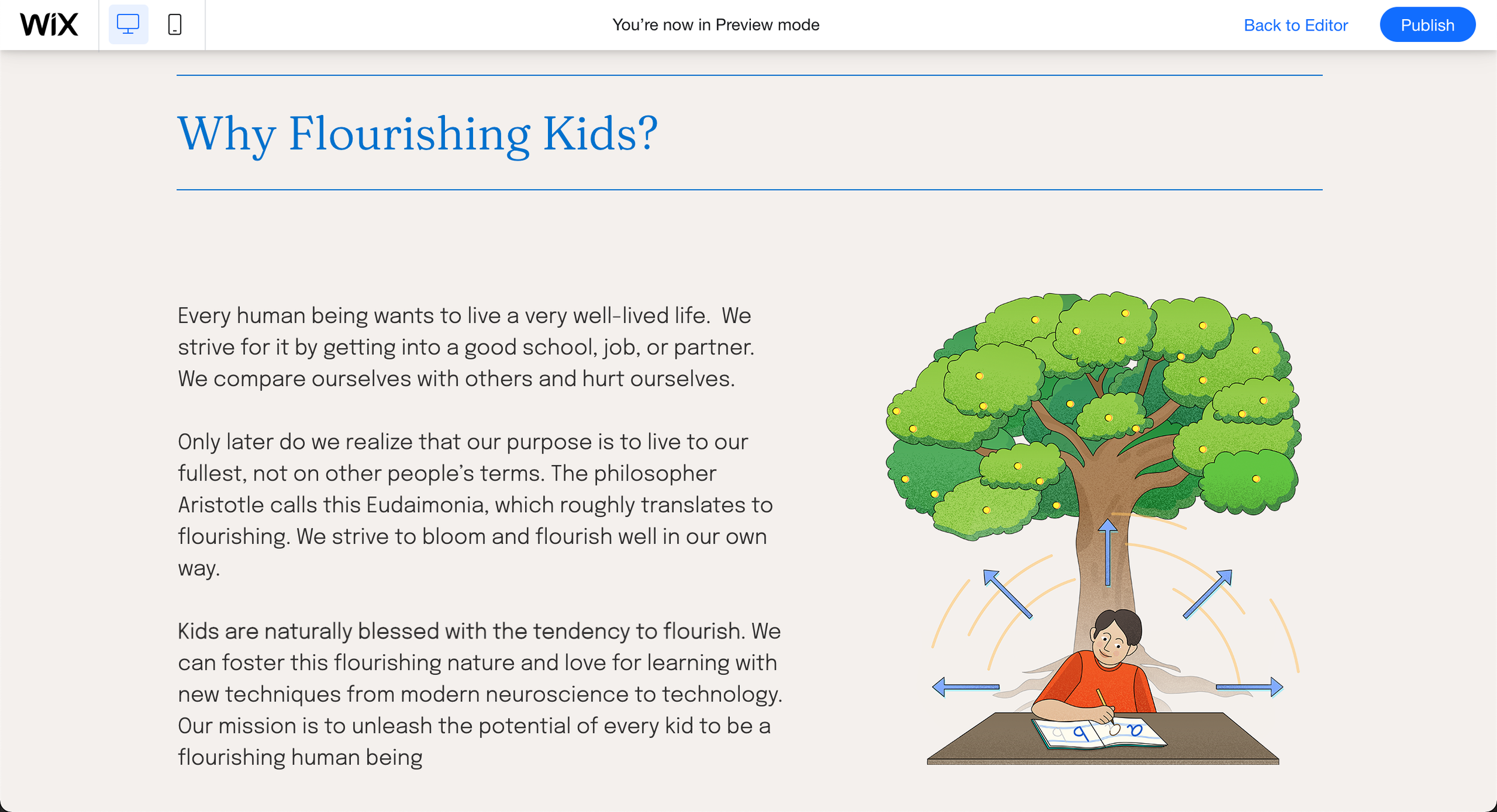
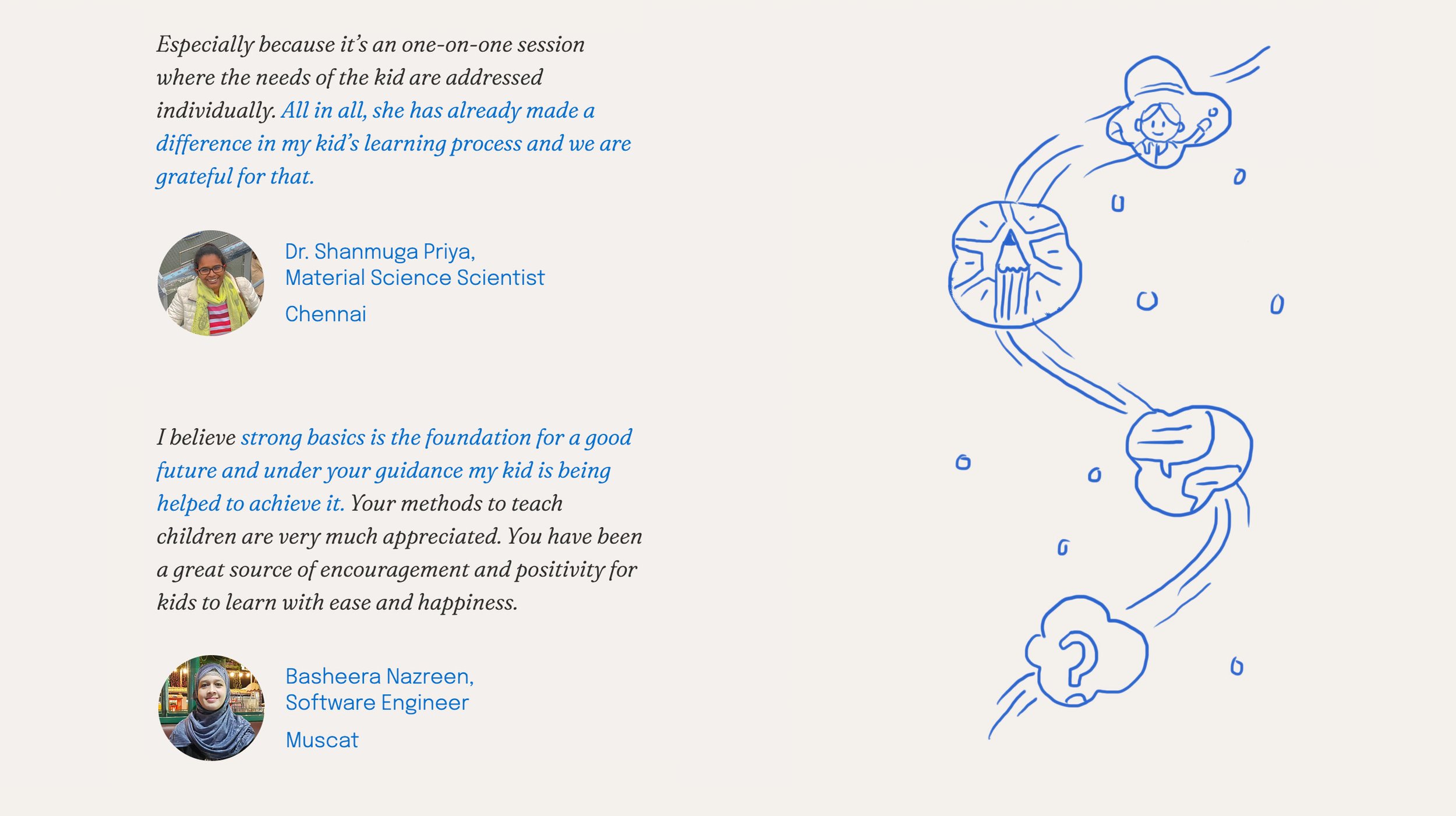
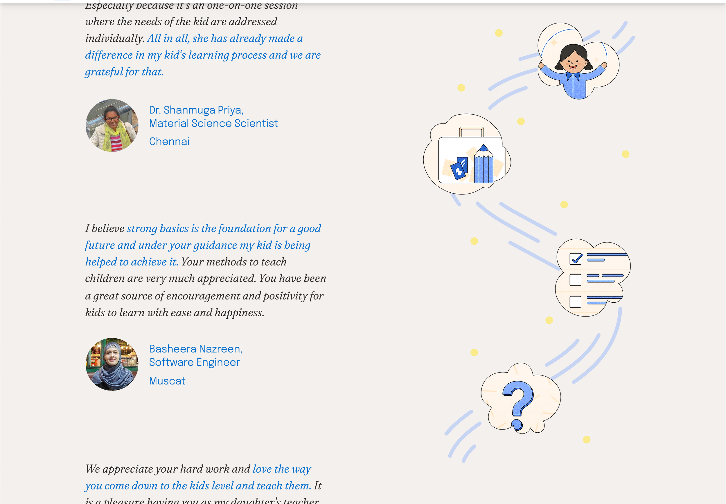
Illustration for Testimonials section depicting how Flourishing Kids helps children and their parents on their journey to overcome gaps in learning.