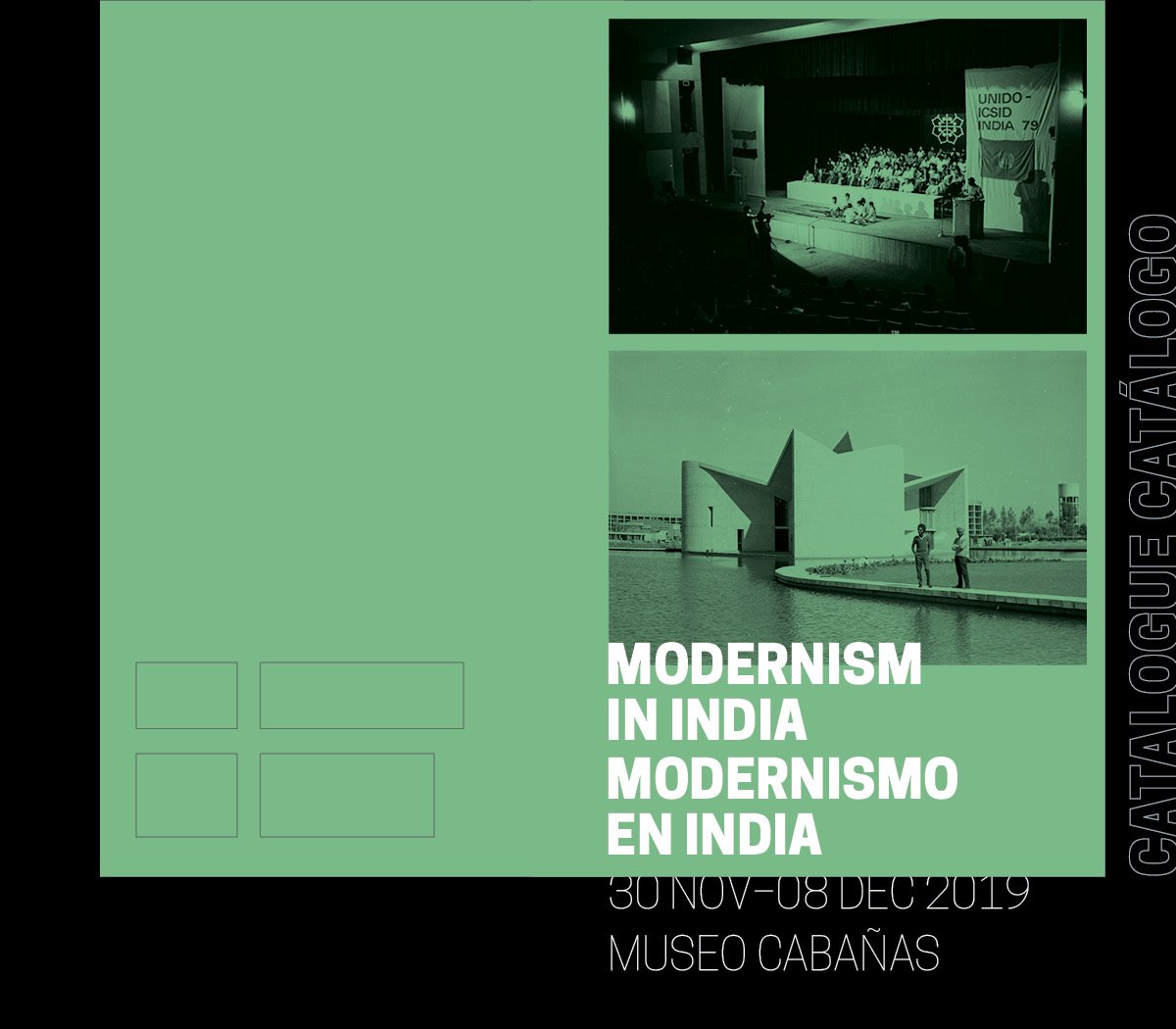
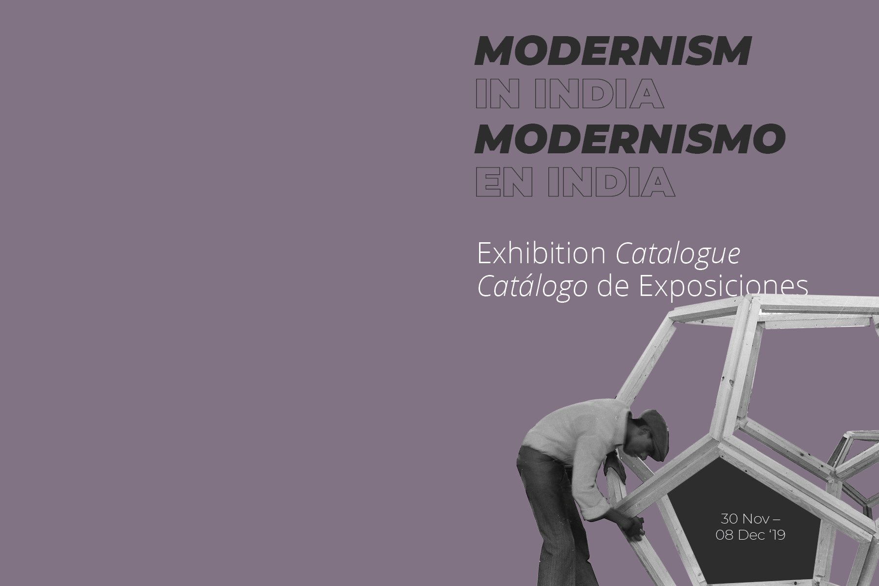
Modernism in India:
Through the NID Archives
Exhibition Catalogue Design
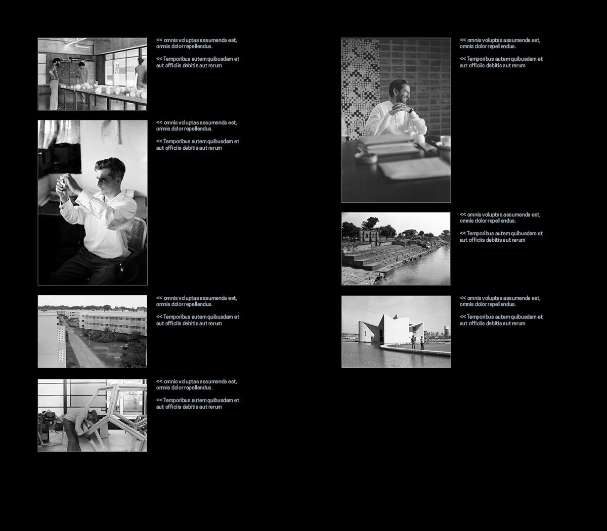
I worked on the design of the exhibition catalogue for the exhibition ‘Modernism in India: Through the NID Archives’, as a part of my Graduation Project at the National Institute of Design. The brief was to bring an essence of modernism into the creation of the catalogue and also use limited colours in the creation of the same. I was briefed on the layout of the exhibition and provided with various images for the initial designs. A week later, I also got the opportunity to attend a talk by Prof. Ashoke Chatterjee at the Paldi Campus, titled “The NID Experiment in Modernity”. This helped me understand the history behind the setting up of NID and other events that were instrumental. It also helped me in the selection of images for the catalogue.
Arriving at the form
I was provided with some catalogues/pamphlets for reference, by Rishi Singhal. By doing an exercise I tried to understand the commonly used sizes in designing the catalogue. I traced the final 2D form of all the catalogues in hand. The largest size was almost an A4 size and the smallest size was an A6 size. The closer the sizes were to that of the standard sizes, the lesser the wastage of paper and cutting requirements.
Initial Approaches
After exploring the 2D forms of various catalogues, I decided to work on two approaches: a book-based bound catalogue format with a substantial amount of text and scope to include many images and a foldable catalogue that could be printed in bulk on a standard size of paper.
Book Form / Option 01
Size: 4 inches by 7 inches
Style: Two-column layout with English and Spanish text running in parallel. Dark grey background with bright green titles and pages.
Typefaces used: Cooper Hewitt
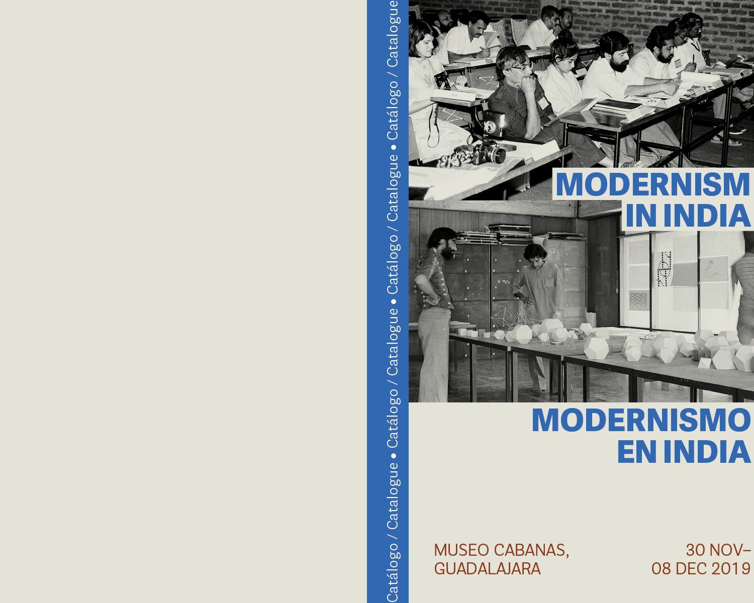
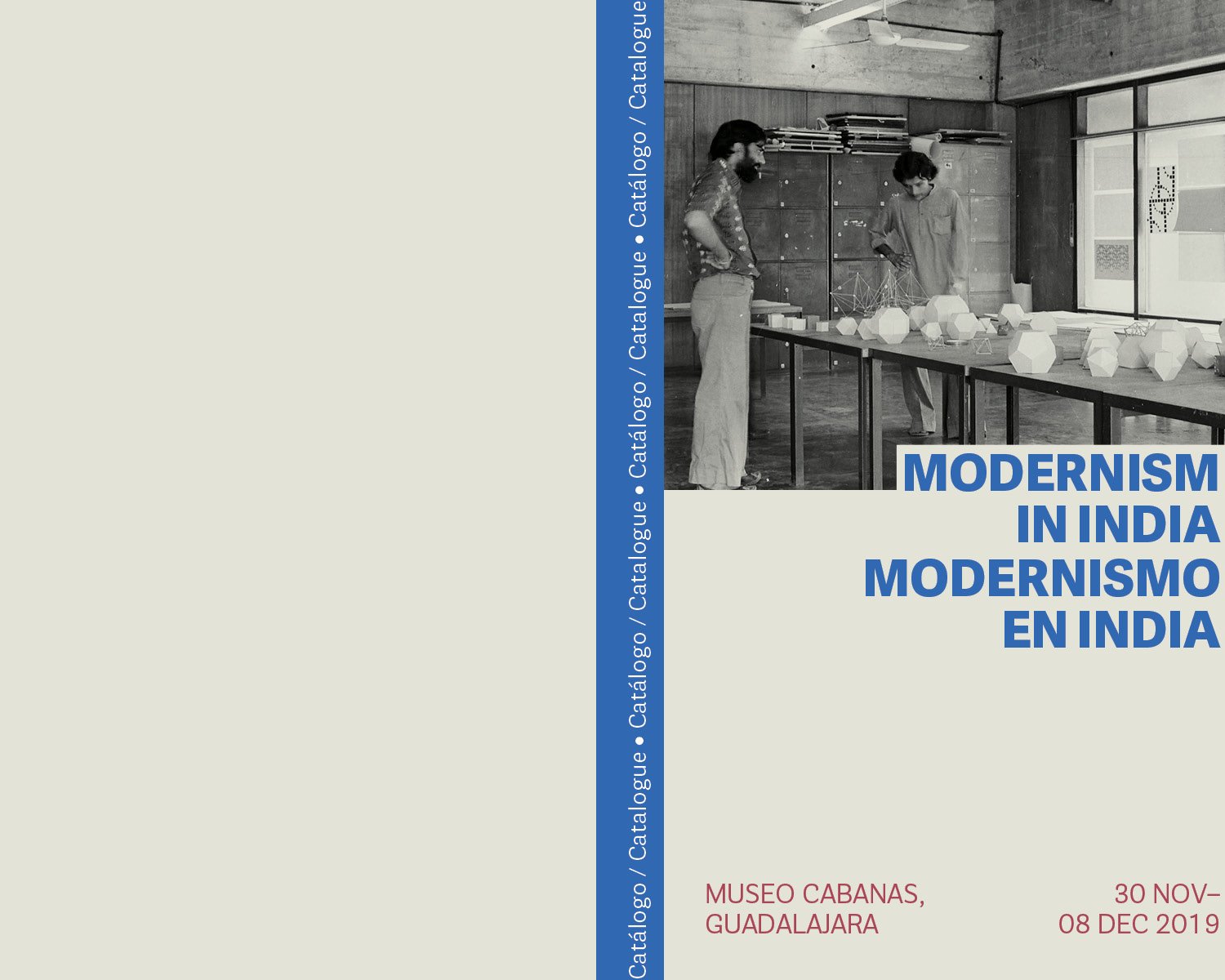
Book Form / Option 02
Size: 5 inches by 8 inches
Style: Two-column layout with English and Spanish text placed one after the other. Beige background with bright blue titles and green pages.
Typefaces used: Adelle Sans and Parry Grotesque
Book Form / Option 03
Size: 6 inches by 8 inches
Style: Two-column layout with English and Spanish text placed in a column each. Dull mauve coloured background with light grey/white titles.
Typefaces used: Open Sans and Montserrat
Foldable Form
Size: 33.1 inches by 11.7 inches (two catalogues printable on one standard A1 sheet)
Style: Two-column layout with English and Spanish text placed one after the other. Beige background with dark purple titles and grey.
Typefaces used: Cooper Hewitt


Final Form
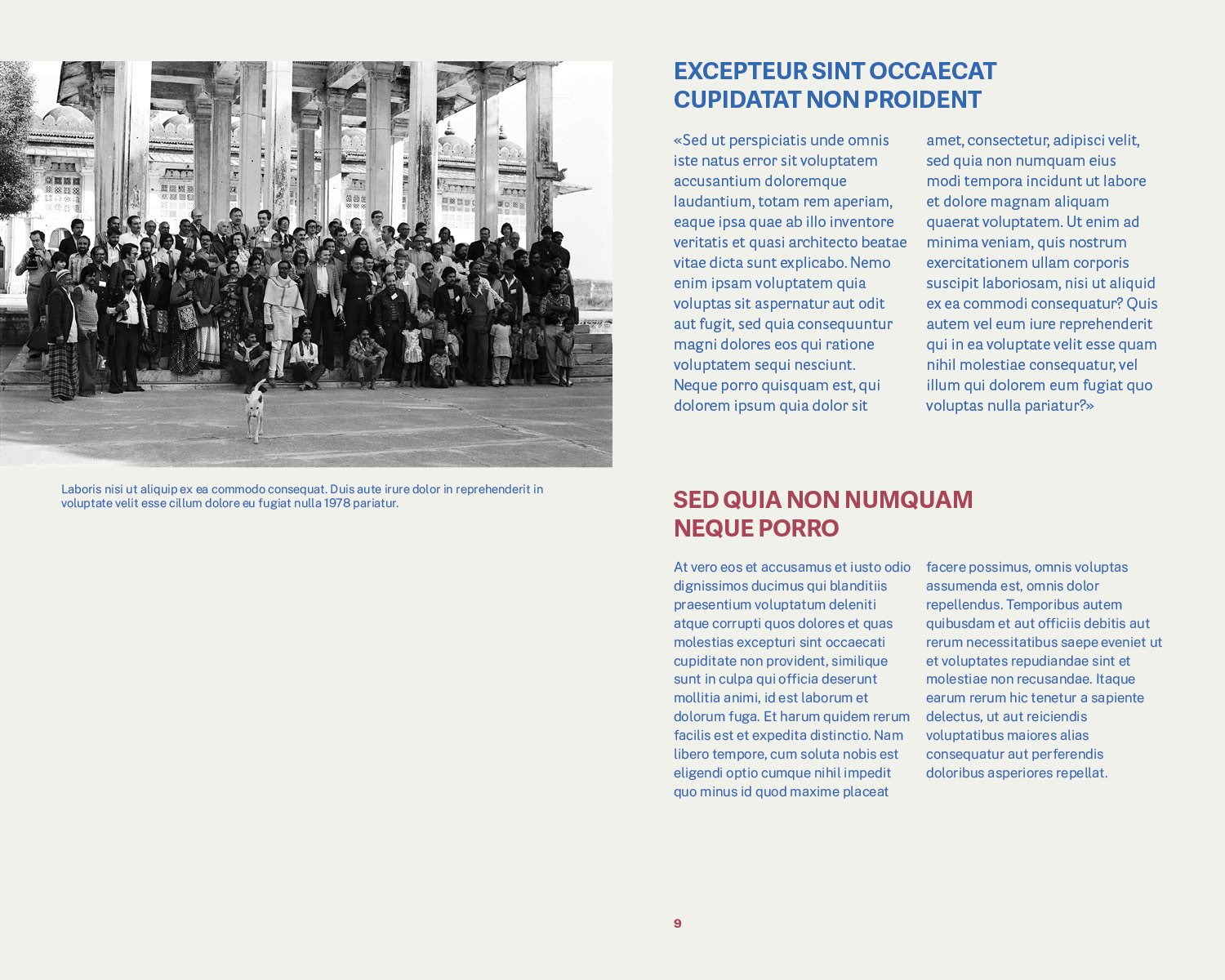
Catalogue option 02 was the final choice for the catalogue. I then proceeded to design the inner pages and used the typefaces Cooper Hewitt and IBM Plex Sans. I liked the legibility and the form of the font IBM Plex Sans, an open-source font designed by Microsoft predominantly meant for digital content.